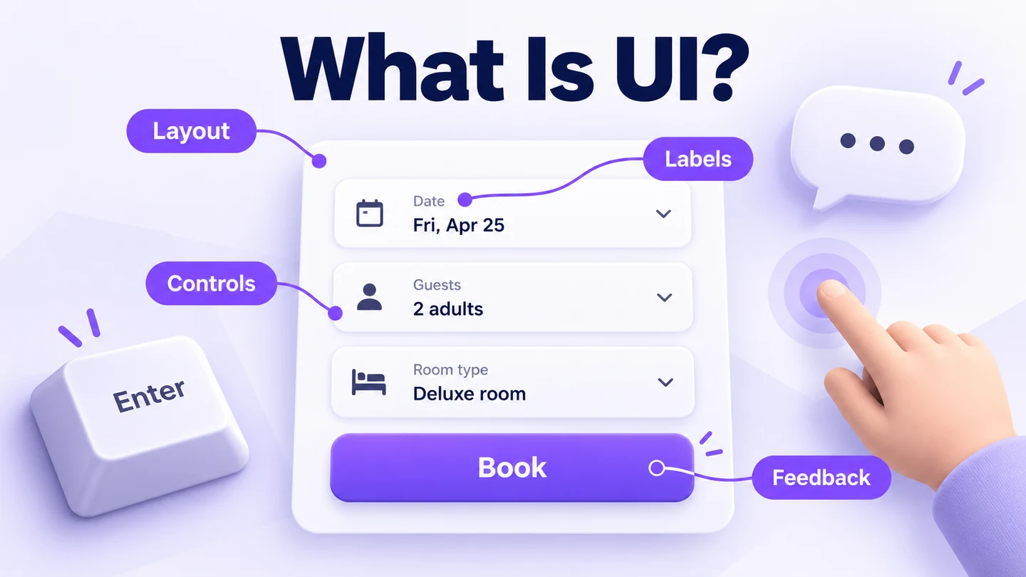
User interface (UI) design is the work of shaping the controls, information, layout, and feedback through which people use a product. It includes how an interface looks and how its states communicate what a person can do, what is happening, and what to do next. A well-designed button needs more than an attractive color: it needs a clear purpose, a recognizable state, and an understandable result.
This guide explains five common interface types and the responsibilities of a UI designer. To explore the visual side yourself, Mockitt Design provides a workspace for arranging screens and reusing components. Start with a small task, such as registering for a community class, so that each design decision has a purpose.
What Is UI Design?
UI designers create the parts of software and digital devices that people interact with. In a graphical interface, these include buttons, text, sliders, images, input fields, menus, screen layouts, and transitions. Designers choose typography, spacing, and color, but also define how a selected tab differs from an unselected one, how an error is explained, and how a user knows an action has finished.
For apps and websites, UI design brings appearance and interactivity together. Its aim is to help people understand the interface and complete their tasks with reasonable effort. Familiar patterns can reduce learning, but no arrangement is automatically intuitive for every audience. A first-time visitor, an experienced administrator, and someone using assistive technology may need different support.
Visual language makes a product coherent and consistent across screens. UI also contributes to the broader user experience: a clear registration form helps someone sign up, while class availability, payment handling, and the confirmation email affect the experience beyond that form. The difference between UI and UX is useful here because the two disciplines share goals without covering exactly the same work.
Types of UI Design
These five types describe ways people communicate with a system. They are not mutually exclusive: a mobile app can combine a graphical interface, menus, forms, and a text-based assistant.
1. Command-Line Interface
A command-line interface responds to commands that a user types. It is a long-established interface type and remains useful for tasks such as administering systems or repeating operations through scripts. Remembering syntax can be difficult for beginners, so command help, sensible error messages, and completion suggestions matter. A CLI is not inherently unsuitable for a novice; suitability depends on the task, the user's knowledge, and the support the interface provides.
2. Graphical User Interface
A graphical user interface presents visual elements such as buttons, icons, images, and menus. Many desktop interfaces follow the windows, icons, menus, and pointer model, often shortened to WIMP. That is one familiar arrangement, not a definition of every GUI. A touchscreen interface may use direct taps and gestures rather than a pointer, and graphical controls can also be operated with a keyboard or assistive technology. Designers need to consider these interaction methods alongside the visual layout.
3. Menu-Driven UI
A menu-driven interface lets people choose from a set of options. ATMs, information kiosks, and ticket machines are common examples, while websites and applications also use menus and submenus. The design challenge is to group and name choices so users can predict where each one leads. A flow diagram can help a team map the routes, but UML modeling is not a prerequisite. Clear back, cancel, and home routes matter when a user chooses the wrong branch.
4. Form-Based UI Design
Form-based interfaces collect information through text fields, text areas, dropdowns, radio buttons, checkboxes, and related controls. They appear in website registrations and in tools used by staff entering information during a phone call. Choose a control to match the answer: a short, exclusive list may suit radio buttons, while a free-form message needs a text area. The interface must explain what each field asks for and what happens when required information is missing.
5. Natural-Language UI
A natural-language interface accepts everyday language through text, speech, or both. Voice assistants are one example; a typed conversation is another. Design work includes prompts, responses, confirmation, and recovery when the system misunderstands a request. For a consequential action, such as canceling a booking, the interface should make the intended action clear before completion. A conversational style does not remove the need for visible status or an alternative way to proceed.
What Does a UI Designer Do?
Designing
A UI designer turns ideas into screens and visual touchpoints, including the interactions behind them. This involves creating layouts, visual patterns, hierarchies, and spacing between elements. A shared visual language or style guide helps the interface stay consistent. Designers also consider responsive layouts so content and controls work across relevant devices, rather than simply shrinking a desktop screen.
The work can include creating buttons, sliders, scrollbars, and icons; choosing type; defining animation; and specifying the states of interactive elements. Wireframes, sketches, and mood boards help explore ideas before refining the details. These are part of a practical set of UI designer skills, alongside the ability to explain why a design supports a user's task.
Consider a community-center class registration form. The design needs to show a class, collect contact details, and explain whether registration succeeded. The following decisions connect appearance to behavior:
| Interface part | Design decision | What the user should understand |
|---|---|---|
| Label and instruction | Show “Email address” above the field and explain that the class confirmation will go there. | What information to enter and why it is needed. |
| Choice control | List the available class times with one radio button per option. | Only one time can be selected for this registration. |
| Feedback | Identify a missing email beside the field; after success, show the chosen class and date. | How to fix a problem, or what has been confirmed. |
WCAG's guidance on labels and instructions calls for cues when an interface accepts user input. A placeholder that disappears during typing is a poor substitute for a persistent field label. The implemented form also needs correctly associated labels and appropriate keyboard behavior; a visual mockup alone cannot establish accessibility.
Collaboration
UI designers work with other people to make a design useful and feasible. They need to understand the brand, the organization's goals, and users' expectations. Collaboration with researchers, content designers, product managers, and developers helps turn those requirements into specific decisions. In the class example, staff must explain registration rules, while developers clarify how availability and submission failures will be handled.
A useful handoff includes more than a polished default screen. Share the selected, loading, error, and success states, along with unresolved questions. When an implementation constraint changes a design, review its effect on the task rather than treating the visual file as a fixed promise.
Prototyping and Testing
Prototypes make visual designs and proposed interactions available for review before full implementation. Ask someone to register for a class, then observe whether they understand the time selection, notice missing information, and recognize the confirmation. This can reveal problems that a static screen misses. Testing helps reduce uncertainty; it does not guarantee a flawless final product.
The UI design process includes revising the design as evidence arrives. A prototype can simulate a full class or a failed submission, while actual capacity checks, saved records, and accessible behavior still need implementation and testing in the working service.
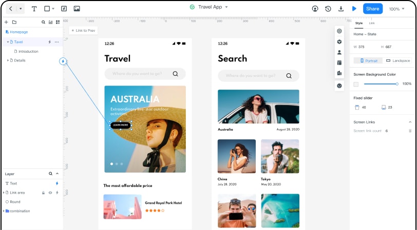
Explore a UI Design with Mockitt
Mockitt can support visual exploration and shared review. Its current design workspace offers vector tools, templates, reusable components, and variables for properties such as colors and text. For the class form, begin with a single screen, establish the field and button styles, and reuse those choices when you add an error or confirmation state.
Choose features according to the design question:
- Templates and components: start with familiar structures, then adapt the content and layout to the actual registration task.
- Variables and shared styles: keep related text and color decisions consistent as the design changes.
- Vector editing: adjust icons and other interface elements when an existing asset does not fit.
- Comments and collaboration: place feedback beside the screen or control that needs a decision.
- Design handoff: share dimensions, styles, and exported assets for implementation review.
When the question concerns movement between screens, Mockitt's prototyping workspace can connect actions and preview a flow. Keep the exercise small: the initial form, a correctable error, and a successful registration are enough to start a focused conversation. The result is a design to evaluate and build, with usability determined by how well people can complete that task.