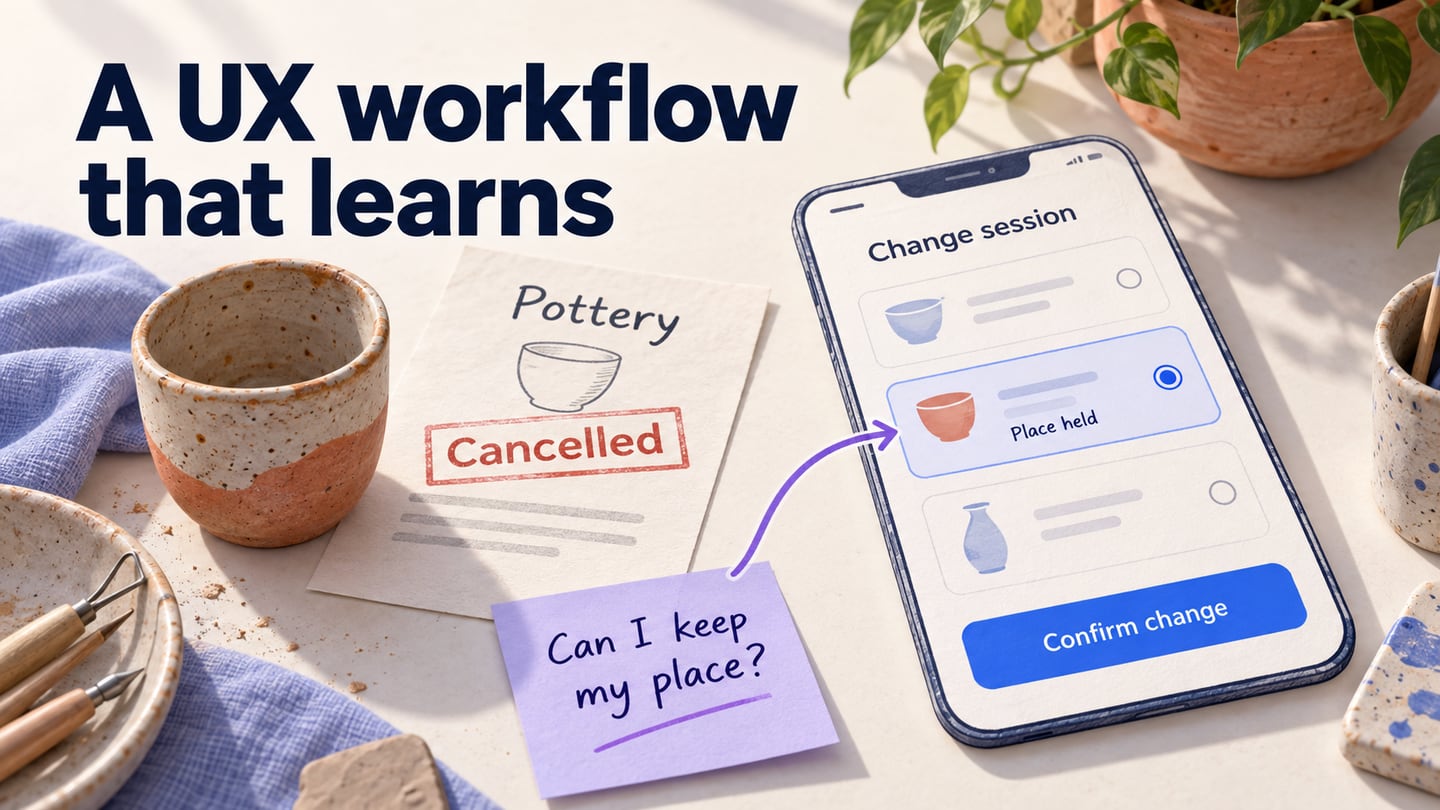
A UX workflow organizes the work needed to understand a user problem, explore a design, test it and carry it into a working product. It is the team’s process, rather than the experience itself. The user experience includes what people understand, do and feel across their contact with a product or service; UI design shapes the controls and information they use along the way.
The workflow connects research and project scope to wireframes, prototypes, feedback, implementation and evaluation. These activities do not have to happen once in a fixed order. A test can expose a missing requirement, while a technical constraint can send a design back to an earlier sketch. Each step should leave the next person with a clear question, a usable artifact and an owner for the next decision.
The five stages below retain a practical route from an app idea to improvement after launch. To make the handoffs concrete, consider a community-class booking service where a customer needs to reschedule a cancelled pottery class. The goal is to find another suitable session without losing track of the original booking.
Step 1: Sketch the idea and research the task
Start by understanding the people and circumstances behind the task. For the class-booking service, ask how customers currently hear about cancellations, what constraints affect their choice of another session and what happens when none of the alternatives works. Sketch the current situation and separate observed problems from assumptions. A persona or storyboard can summarize what you learn, but it should not replace the research that supports it. Record the main task, the evidence behind it and the unanswered question before listing possible features.
Step 2: Create wireframes and connect the screens
Arrange the research into a sequence: open the cancellation notice, compare sessions, choose one and confirm the change. Mockitt’s online prototyping workspace lets you represent screens and connect them for review. Start with the smallest flow that answers the research question; visual polish can wait until the structure is understandable. Check current plan conditions before assuming a particular project, sharing or export limit.
Kick start your UX
Create a project and choose a canvas suited to the device you are exploring. Name the screens by their role in the task, such as Cancelled class, Available sessions and Change confirmed. This makes the flow easier for reviewers to follow than a sequence of unnamed screens.
Mock it up
Use the canvas to show the information a customer needs at each decision. On Available sessions, include the date, time, location and remaining availability. If a session cannot be selected, explain why instead of presenting an unexplained disabled control.
- Add widgets and icons to represent the interface. Edit labels and content before fine-tuning decorative details. Reuse repeated session rows so that the same information appears in the same order on each option.
- Link the relevant screen or widget to the next step using the linking controls available in your project. Include a route back to the options and a route for no suitable session. A prototype link simulates navigation; it does not update a real booking.
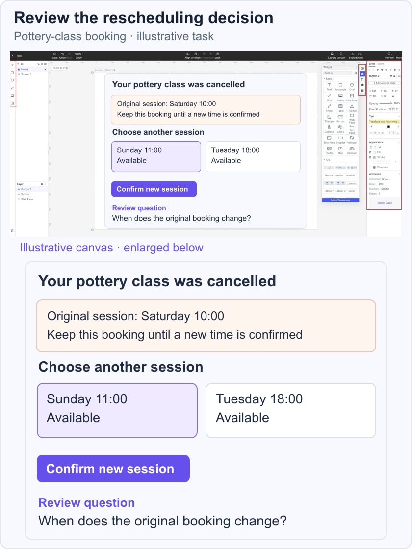
- Add notes where the interface cannot explain a requirement by itself. For example, annotate when the old place is released and which team member must confirm that rule. Keep implementation questions separate from text intended for customers.
- Add interaction states only when they answer a review question. A selected row and a confirmation message may communicate this task more clearly than decorative animation. Record the default, selected and unavailable states so the developer does not have to infer them.
Step 3: Test the prototype with a task
Preview the flow yourself first, then ask someone from the intended audience to use it without coaching. Ask a participant to move a cancelled pottery class to another available session. Observe where they look for their current booking, whether they understand the alternatives and what they expect Confirm change to do. Share the prototype through the project’s supported review flow and record specific behavior, not just whether the reviewer likes the screen. If participants think they will lose their place while browsing, revise the selection screen to explain when the booking changes and test that understanding again. Prototype review can reveal interaction problems, but it does not test the live scheduling service, authentication or payment handling.
Step 4: Prepare the design for implementation and release
A launch needs more than a working prototype. Agree on the acceptance criteria, identify states that the development team must implement and verify that the real service behaves correctly. In the rescheduling example, that includes conflicting availability, a failed confirmation request and a notification that matches the saved booking. The design handoff should name unresolved decisions rather than presenting them as completed features. Product, design, engineering and support can then agree whether the release is ready and how customers will learn about it.
Step 5: Gather feedback and decide what to revisit
After release, combine customer feedback with relevant support cases and observed product behavior. A complaint about finding a session may indicate unclear navigation, unavailable inventory or a rule that the interface does not explain; each calls for different work. Record the problem, supporting evidence, responsible owner and next check. Return to research when the cause is unclear, or revise and test the affected screen when there is already a supported design hypothesis.
A useful UX workflow makes decisions visible and gives the team a way to revise them. Keep the research question, prototype and feedback connected as the design moves toward release. For the next iteration, choose one unresolved task and improve the part of the flow that affects it, rather than restarting every stage or polishing every screen.