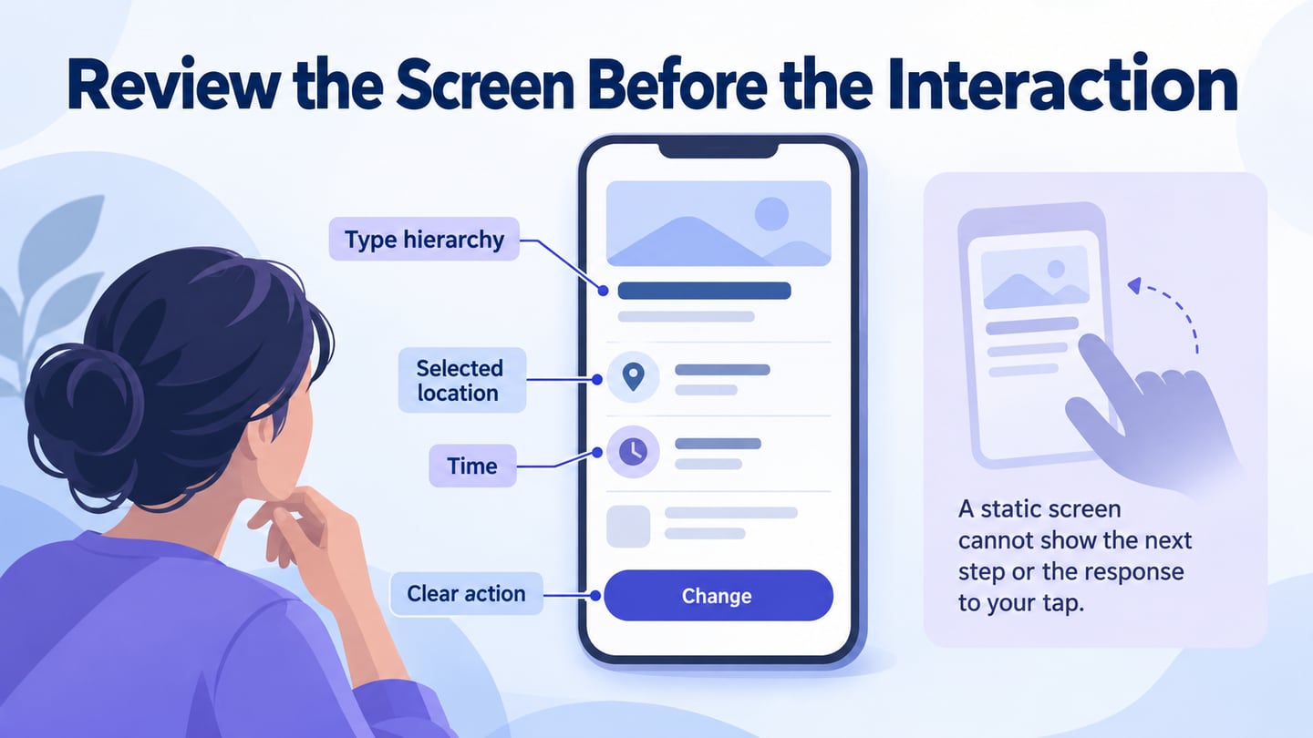
A UX flowchart maps how a person moves through a task, including actions, decisions and possible outcomes. It can describe a website or application, not only a mobile app. A simple flowchart emphasizes the logic; a wireflow combines that logic with screen sketches.
Use the diagram to expose missing routes and discuss how the experience should work. It does not prove that users need the feature or that the implemented service behaves correctly. The workflow below connects screen building with the decision logic that makes a flow useful.
Choose the Representation for the Question
A flowchart is useful when the main question concerns a sequence or branch. A linked prototype is useful when reviewers need to interact with the screens. Wireflows combine aspects of both. Choose the level of detail needed for the discussion rather than draw a polished screen for every step.
What to Review with Mockitt
Use Mockitt’s flowchart workflow for a diagram, or linked prototype screens when you need to review interactions. Confirm the current controls and access available in your workspace.
- Arrange actions and decision points with readable labels.
- Connect relevant screens or states to demonstrate the proposed path.
- Record unresolved questions beside the part of the flow they affect.
- Reuse available shapes or widgets while keeping their meaning consistent.
- Share the diagram and task context with reviewers.
- Check sharing permissions before including sensitive business information.
- Use synthetic records where the flow involves accounts or personal information.
- Verify current export options only if the review process depends on them; a diagram does not require a production-code export.
- Hand off the decisions and exception rules as well as the visual sequence. Developers still need to implement and test the actual behavior.
How to Create a UX Flowchart
Follow these six steps from project setup to preview. The screenshots illustrate earlier Mockitt interfaces. The running example is a music-search task, with a fictional track and explicit recovery when the result cannot be played.
Step 1: Open Your Workspace
Sign in to the appropriate workspace and decide whether the deliverable is a logical diagram, a wireflow or a clickable prototype. State the user task and the intended starting point before creating screens.
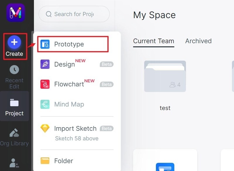
Step 2: Create the Project and Define the Boundary
Create a project for finding and playing a track. Define the start as entering a search query and the end as playback beginning or the person returning to choose another result. Account setup and subscription changes can be separate flows unless they are part of this question.
Choose a canvas or layout suitable for the representation. A diagram does not need a phone-sized canvas; screen sketches should reflect the target device.
Step 3: Add the Actions and Screens
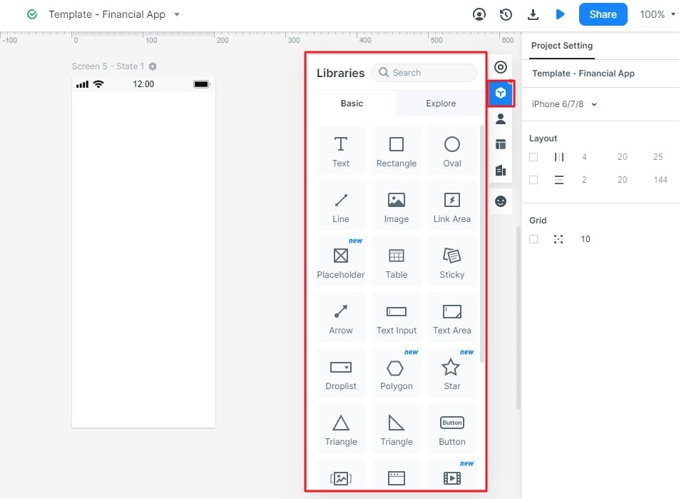
Add only the screens or nodes required for the task: search input, results, track details or player, and the relevant unavailable state. Label each node by what it represents.
Use a small, consistent visual vocabulary. For example, rectangles can represent actions or screens and diamonds can identify decisions. Include a legend if the audience may interpret the symbols differently.
Step 4: Map the Necessary Decisions and States
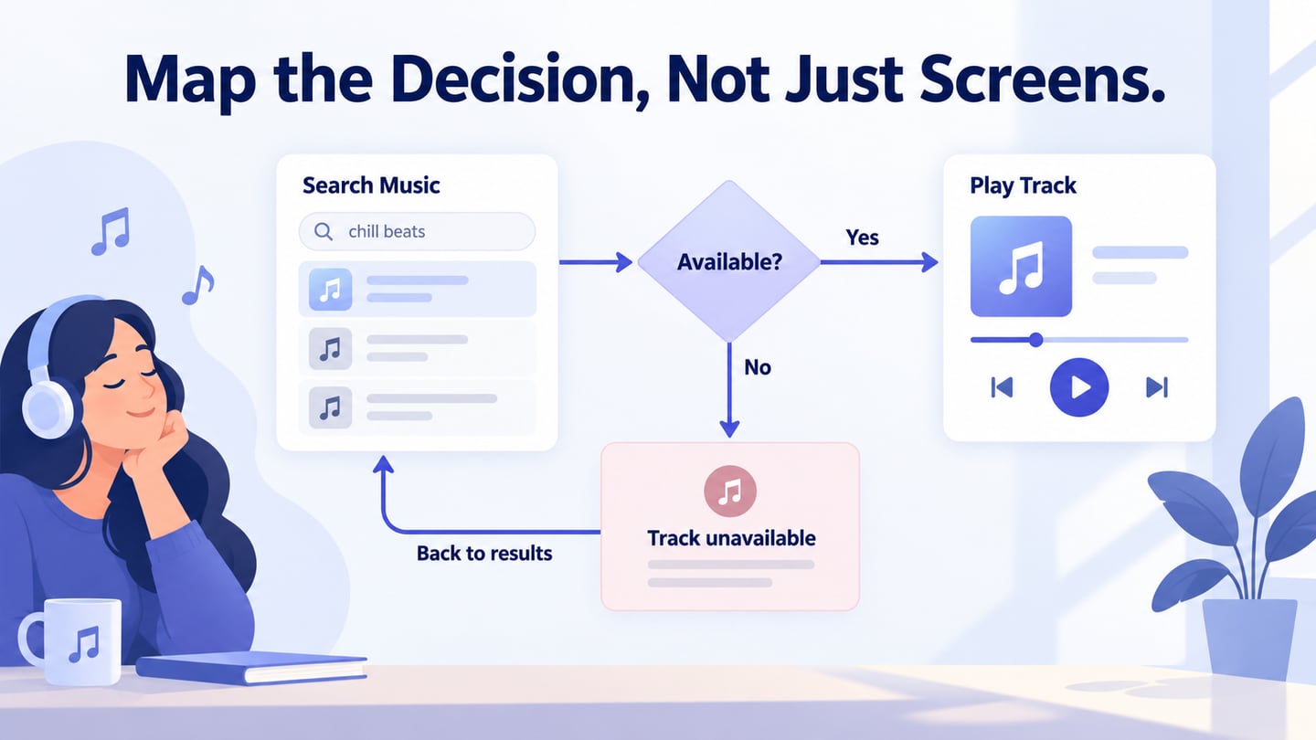
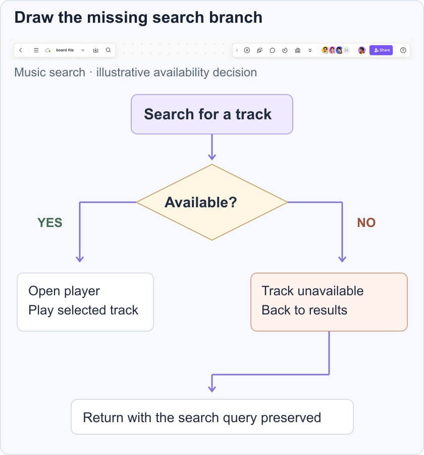
In the music-search example, a result can be available or unavailable. Add an Available? decision: Yes leads to the player; No leads to a Track unavailable explanation and a route back to results. Also decide whether the query and scroll position are preserved. These are proposed design rules, not claims about a working music service.
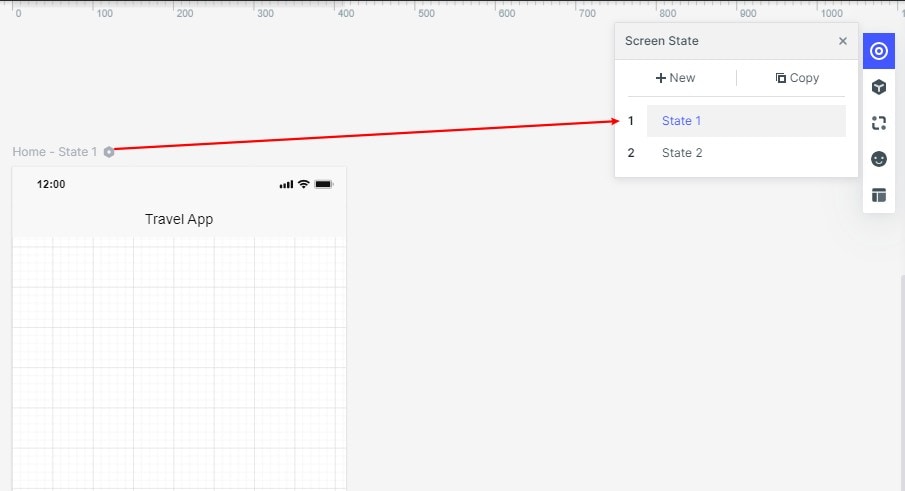
Step 5: Connect and Label the Paths
Connect each action to the next state and label decision branches explicitly. Avoid a line that forces the reader to guess what condition caused the transition. A return arrow is valid when the task includes correction or retry; a flow does not have to be strictly one-way.
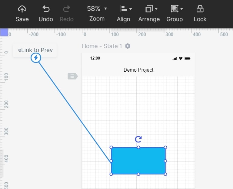
Step 6: Review the Flow and Prototype
Review the diagram for missing paths, then preview linked screens if the deliverable includes a prototype. The purpose is to test the explanation of the flow before implementation.
- Review on Desktop
Start at the named entry point and follow the ordinary path. Ask a reviewer to explain the outcome of each decision without adding instructions that are absent from the diagram.
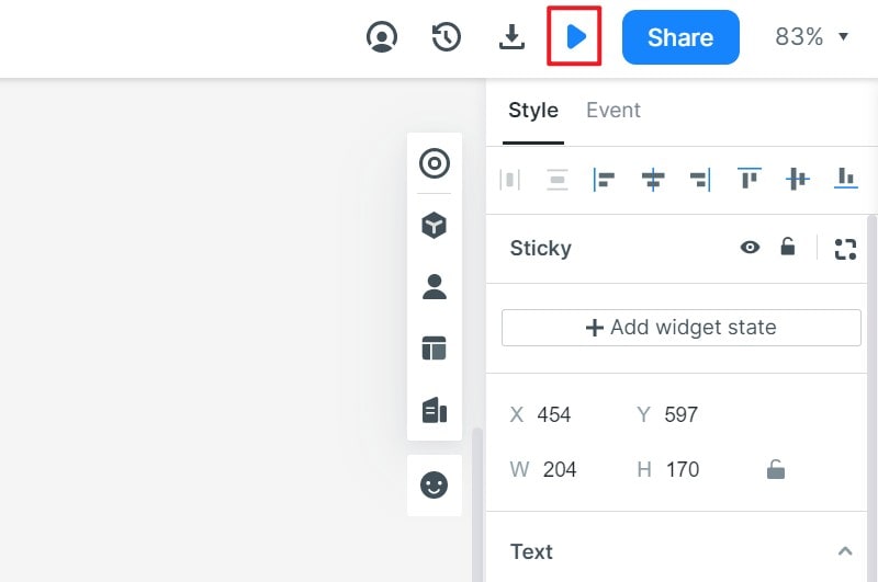
- Review at the Target Device Size
Use the supported preview or sharing route in the current workspace. Check that the unavailable message and return action remain understandable on a narrow screen.
- Review the Exception Paths
Review these task questions in the diagram and prototype:
- What happens when no search results match the query?
- Can someone return from an unavailable track without starting the search again?
- Is a service error distinguishable from an unavailable individual result?
Recap the agreed flow in words: enter a query, inspect results, select a track, evaluate availability and either play or recover. If the diagram cannot be explained clearly, revise its labels or scope before adding more visual detail.
Share the design with the assumptions and open questions attached. A no-code flow representation helps communication; it does not implement playback, search ranking or availability rules.
Tips for Creating UX Flowchart
Once the basic flow is visible, use the following tips to improve its usefulness for the people reviewing it.
Check the diagram against a concrete task rather than judging it only as a neat arrangement of boxes.
Understand the User’s Goal
Use research and task evidence to identify where the flow starts and what completion means. User flows and broader journeys describe different levels of experience; do not overload a single task diagram with every touchpoint in a person’s relationship with the service.
In the music example, searching and playing are the immediate task. A person may need to inspect several results before finding a playable track. Include that possibility instead of assuming the first result always succeeds.
Use Consistent Symbols and Conditions
Choose a notation and apply it consistently. If a diamond means a decision, do not use the same shape for an ordinary screen merely because it fits the page.
Label the branch conditions and show where loops return. Check for disconnected nodes, decisions with only one unexplained exit and endings that do not match the stated goal.
Keep the Diagram Readable
Visual styling should help reviewers follow the logic. Use spacing and alignment to reduce crossing lines, and reserve emphasis for distinctions that matter.
- Use meaningful labels that describe an action, state or decision.
- Provide a readable text explanation for complex paths.
- Do not rely on color alone to distinguish success and recovery routes.
- Keep the scope small enough to scan, linking to a separate subflow when necessary.
Next Step
A useful UX flowchart makes decisions and recovery paths discussable before they become implementation assumptions. Start with one task, preserve its context across branches and use a prototype where screen-level interaction needs review.