UX design patterns are reusable approaches to recurring interaction problems, such as finding a destination, entering information, or recovering from an error. A familiar pattern can help people understand an interface, but familiarity alone does not prove that it fits a particular task. Use the UI design pattern guide for the component-level view; this article focuses on the behavior, context, and tradeoffs that make a pattern useful.
Use a Prototype to Evaluate a UX Pattern
Mockitt can help turn a proposed pattern into screens and interactions that reviewers can inspect. Use an interactive prototype to explore the normal path, alternatives, and recovery states. The tool supports the design discussion; it does not guarantee a good experience or replace research with the intended users. The retained screenshot below shows an earlier editor interface rather than a current mobile editing application.

Reusable widgets and visual assets can make a pattern consistent across screens, but begin with the behavior you need to explain. Lay out the relevant states together, connect the actions, and annotate the decisions that remain unresolved. Share the review artifact with appropriate access permissions and ask people to attempt the task without describing the intended route first.
What are UX Design Patterns?
A UX design pattern describes a recurring problem, a solution approach, and the context in which that approach makes sense. For example, a multistep form can divide a complex task into manageable stages, but it also needs clear progress, preserved answers, and a way to return. A pattern is not a promise that every user will complete the task quickly, and no single pattern removes every difficulty with registration or sign-in.
Patterns give teams a shared vocabulary and can reduce the effort required to learn an interface. That benefit depends on clear labels and behavior consistent with expectations. A recognizable menu still fails if its destinations are confusing; a familiar confirmation dialog still fails if it conceals the consequences of an action. State the problem and constraints before choosing the pattern.
Worked example: preserve progress in a multistep request
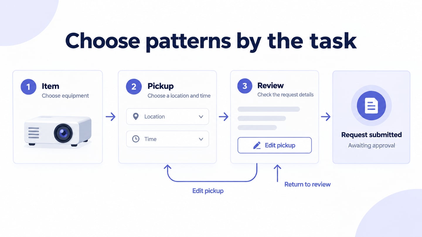
Imagine a three-step equipment-loan request: choose an item, enter pickup details, and review the request. The pattern is a step-by-step flow with a review stage. It is useful only if a person can understand their progress and edit an earlier answer without unexpectedly losing later work.
| Decision | Example behavior | What to inspect |
|---|---|---|
| Progress | Item → Pickup → Review | Can the person tell where they are? |
| Back navigation | Return to Pickup with entered details intact | Are answers preserved? |
| Edit from review | Edit pickup, then return to Review | Is the return destination predictable? |
| Final action | Submit request | Is it clear that approval is still required? |
In the prototype, use a clearly illustrative item such as a portable projector. Prepare the selected item, pickup details, review, and request-submitted states. Do not label the last state “Reservation confirmed” if a real service would require approval. This wording is part of the pattern’s behavior, not a cosmetic detail.
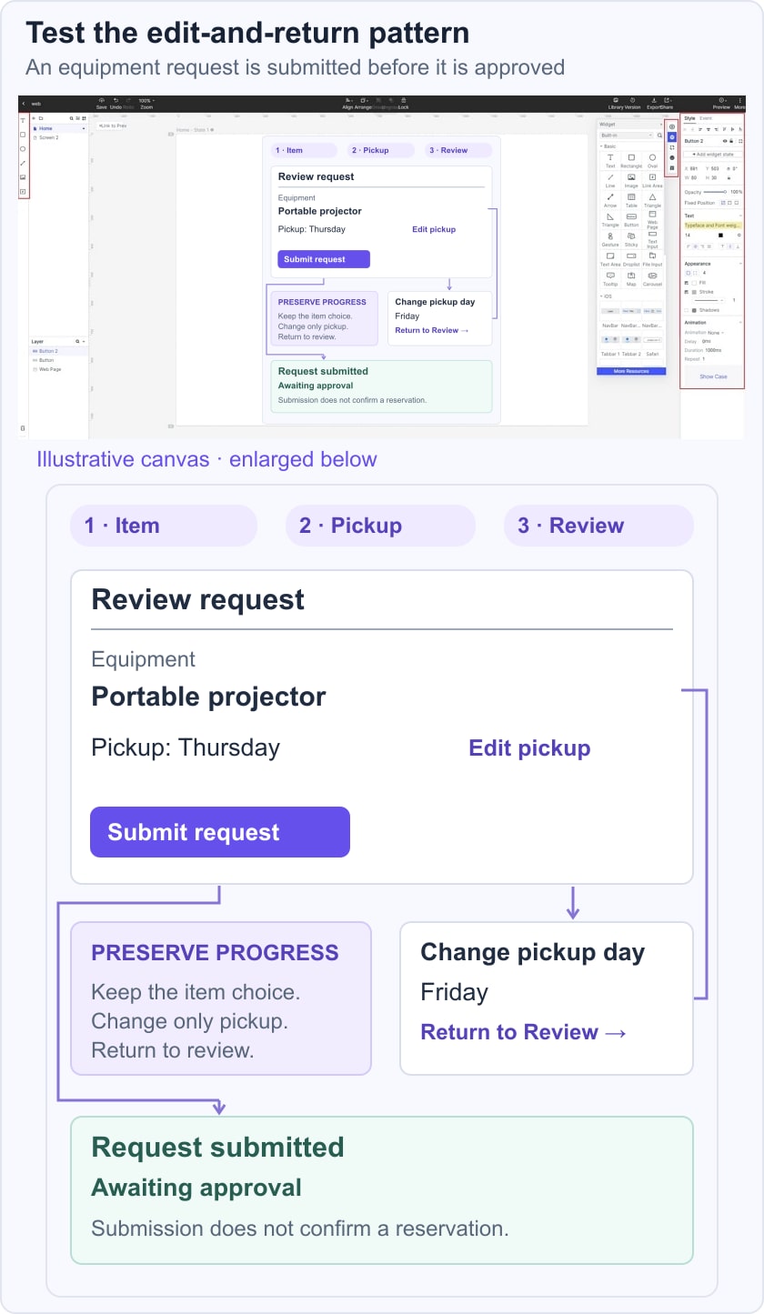
Ask a reviewer to change the pickup day from the review screen and finish the request. Observe whether they expect to re-enter the item choice, whether they understand the final action, and what they believe happens next. Record confusion before explaining the intended design. For planning the session, see usability testing methods.
What does Dark UX Pattern Mean?
Deceptive patterns, often called dark patterns, are interface choices that mislead or pressure people into actions they did not intend. Examples include obscuring cancellation, disguising an advertisement as ordinary content, or making refusal harder to find than acceptance. These patterns are not confined to commerce and should not be presented as legitimate shortcuts to conversion.
Evaluate the effect on the person using the interface rather than assuming you can infer the designer’s intent from a screenshot. A design can be confusing or coercive even when no one describes it that way internally. Nielsen Norman Group’s explanation of deceptive patterns provides examples for recognizing the problem. In a review, ask whether choices and consequences are clear, whether declining is practical, and whether the person can recover from a mistake.
Differences between UI Patterns and UX Patterns
UI and UX patterns overlap. A UI pattern often describes a concrete interface arrangement, such as tabs, a search field, or an accordion. A UX pattern addresses how a person completes a task across those elements, such as comparing options, recovering a draft, or reviewing information before submitting it. Neither category is purely visual.
Consider a checkout review screen. Its UI includes labels, totals, and edit actions. Its UX behavior determines whether editing preserves previous information, whether the final action clearly commits an order, and how errors are handled. An attractive screen can still support a confusing flow.
Choose both the arrangement and the behavior for the task. Do not treat UI as decoration added after UX is finished. Labels, focus order, error placement, and feedback affect usability as well as appearance, so they need to be reviewed together.
Three Product References to Study Critically
1. QuickBooks
QuickBooks is a useful reference category for studying financial dashboards and task-oriented navigation. When reviewing an actual current screen, ask how it separates summary information from actions, identifies incomplete work, and explains a next step. The product’s name or popularity does not establish that every interface is suitable for your users. Record the screen and context you observed before adapting a pattern.
2. PayPal
PayPal provides a reference context for reviewing transaction-related tasks. Focus on questions such as whether the person can distinguish a draft from a completed action, identify the recipient, and understand a confirmation. Do not assume that a historical screen reflects the current service or that an interface pattern alone establishes payment security. Evaluate only the observed behavior relevant to your design task.
3. Google Store
Google Store is a reference context for product discovery and comparison. Inspect how a current page helps someone distinguish variants, compare information, and understand the next action. Avoid attributing rankings, satisfaction, repeat purchases, or bounce rates to its visual design without evidence. A useful reference note records the pattern, the task it supports, its constraints, and what you would test before borrowing it.
A short pattern-review checklist
- Problem: what recurring task or difficulty does this pattern address?
- Context: what information, device, and user knowledge does it assume?
- States: have you included empty, error, loading, and recovery states where they matter?
- Choice: can people understand the consequences and take a reasonable alternative?
- Evidence: what observation would make the team keep, revise, or reject the pattern?
Use a reference to generate a hypothesis, not to certify the design. Keep the pattern’s useful conventions while adapting the labels and states to the actual task. A focused review of one behavior is more informative than copying an entire interface because it belongs to a familiar brand.