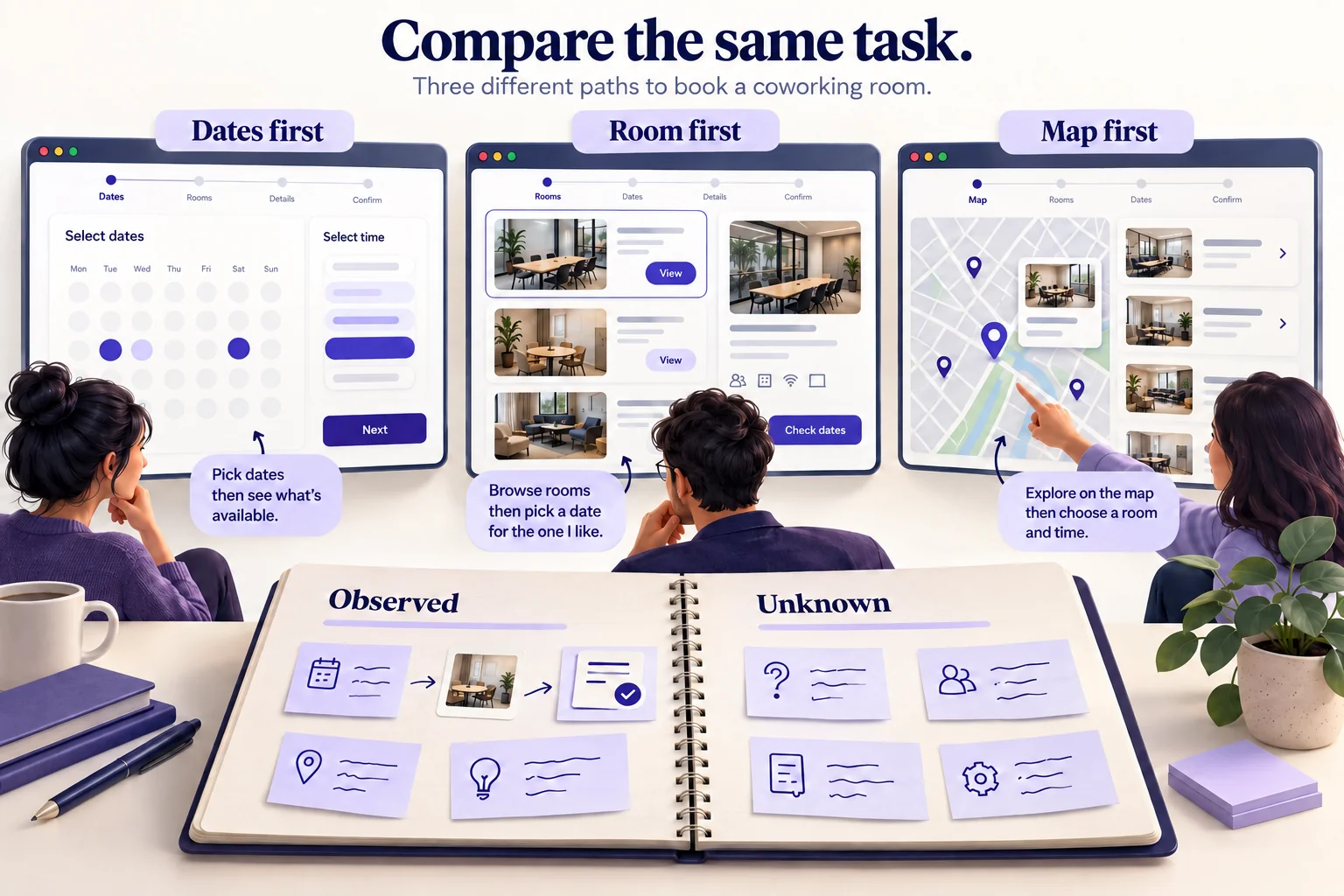
Performing UX competitor analysis is a useful way to understand how other products help people complete a task. Compare their flows, language, controls, and recovery paths, then decide which observations are relevant to your users. The result should be a small set of design questions and opportunities, not a collection of screens to copy.
Competitive analysis is one input to UX research. It shows what other products do; it does not tell you why their teams made those choices, whether the designs perform well, or what your own users need. This guide explains how to make that distinction and turn a review into a prototype you can evaluate.
What is UX Competitor Analysis?
UX competitor analysis is a structured review of other products through the tasks your audience needs to perform. Whether you are designing a website or an app, it can reveal common interaction patterns, differences in information architecture, and assumptions that deserve investigation. You might compare how someone finds an available room, changes a reservation, or recovers from an unavailable time slot.
Start with a decision the analysis should inform. “Which booking details must people know before choosing a room?” is more useful than “Which competitor has the best UX?” The first question gives you a task, a boundary, and evidence to collect. The second encourages a subjective ranking of unrelated features.
Competitive research is useful before a new project and when an existing flow has a specific problem. Revisit the relevant part when the market or your product changes. There is no need to repeat a broad review every time a competitor alters a color or moves a button. Record the date, device, account conditions, and route you examined so the team can interpret the observations later.
Is UX Competitor Analysis Important?
A good analysis helps designers make informed choices about what to investigate and what to prototype. It provides context for a decision rather than proving that one product is universally better.
Find out market gaps
Competitive analysis can expose needs that current products appear to serve poorly. For example, several room-booking services might hide accessibility details until the final step. That is a possible opportunity, not yet proof of demand. Check whether your intended users need those details, when they need them, and whether your organization can supply accurate information.
Develop services or products
Once a gap is supported by user evidence, you can explore how to address it. The improvement may be clearer content or fewer decisions rather than another feature. A booking page that explains capacity, equipment, and cancellation terms together may help more than adding a new filter whose meaning users do not understand.
Solve issues
Reviewing alternative approaches can give you ideas for a usability problem. It cannot resolve every issue by itself. A competing design may have the same problem, serve a different audience, or rely on a business rule you have not observed. Treat the review as a source of hypotheses, then evaluate the proposed change with representative users.
Considerations and Tips for UX Competitor Analysis
Develop comparison criteria
Before exploring products, define the same task for each. Include the starting point, information available to the person, and successful outcome. Add your own product to the comparison when it already exists. This keeps the review tied to a real decision rather than a tally of features.
For a coworking-room service, a task could be: “Find a room for four people next Tuesday afternoon, check that a display is available, and understand the total cost before committing.” Keep the location, device, and account state comparable. If one service requires an account before you can inspect availability, record that restriction rather than inventing the hidden steps.
| Criterion | What to record | Question for your design |
|---|---|---|
| Finding an option | Search terms, filters, and which details appear in results | Can people rule out unsuitable rooms before opening each result? |
| Availability | When dates and times become visible; how unavailable slots are explained | Should the person choose a time or a room first? |
| Price and commitment | Where the total, fees, and cancellation terms appear | Is there enough information to make an informed commitment? |
| Correction | What happens when the person changes the room or time | Can the flow preserve useful choices while recalculating availability? |
| Confirmation | The final status and the route to view or change the booking | Does the person know whether a reservation actually exists? |
Separate three kinds of notes: observed behavior, interpretation, and unknown. “The total appears after selecting a room” is an observation. “People may worry about extra charges” is an interpretation. Whether this affects abandonment is unknown without appropriate evidence. Screenshots and step notes support the first statement; they do not prove the other two.
Understand when to stop
Three to five relevant competitors can be a manageable starting set, but the useful scope depends on your decision. Include direct alternatives and, where helpful, a product that solves the same interaction problem in another field. Stop when you have enough evidence to identify meaningful options and unanswered questions. More screenshots do not necessarily produce a better decision.
Do not just copy the product designs you get in your analysis
Your competitors may not be following good practices, and their constraints may differ from yours. Learn from the problem a solution addresses, then adapt the approach to your users and brand. Do not copy proprietary artwork, distinctive text, or entire screens into the product you ship.
For the room-booking example, a date-first flow may suit people with a fixed meeting time. A room-first flow may suit people seeking a particular venue. Neither is automatically the winner. Write down the audience assumption behind each option before choosing which one to investigate.
Use the right tool
Use a document, spreadsheet, or visual board that lets the team see the evidence beside the interpretation. Keep one record per task and product, with a screenshot reference, observation date, and open question. A numeric score is optional. If you use one, explain the criteria and do not turn subjective impressions into a claim about conversion or satisfaction.
Understand when to carry out a comparative analysis
It can be useful to examine products outside your direct competition. A calendar service may show a useful way to resolve scheduling conflicts even if you are designing a room-booking tool. Record why that example is relevant and where the analogy stops. An interaction that works for a personal calendar may not handle room capacity, approval, or payment.
Use Mockitt to Explore the Findings
Once the review identifies a design question, use Mockitt to build an interactive prototype of the alternatives. Keep the task, example data, and surrounding screens consistent so the review focuses on the decision you want to understand. Create the project, assemble the shared components, edit the alternatives and preview both routes.

Step 1: Create a focused project
Name the project after the decision, such as “Room booking: choose time or room first.” Define the device and a small screen set: room search, selection, review, and confirmation. Add an unavailable-slot state so the prototype covers a realistic interruption rather than only the successful route.
Do not recreate each competitor's entire product. Use your own content and components, and carry forward only the interaction ideas that address the research question.
Step 2: Look for the design components
Use the editor's components and assets to assemble the screen structure. Reuse the same buttons, room cards, labels, and selected states across both options. This reduces incidental visual differences that could distract reviewers from the order of the decisions.
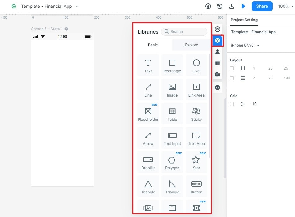
Step 3: Begin the designing
Place the controls on the canvas, then edit their text, size, spacing, and states. In option A, show available times before room details. In option B, show room details before the time picker. Keep the same example rooms and prices. Add a note explaining what is simulated and which behavior would need application logic in a real implementation.
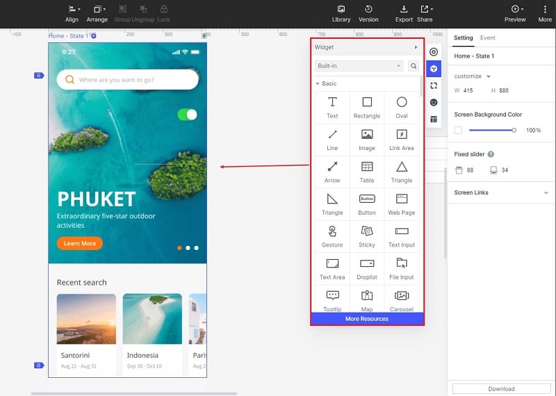
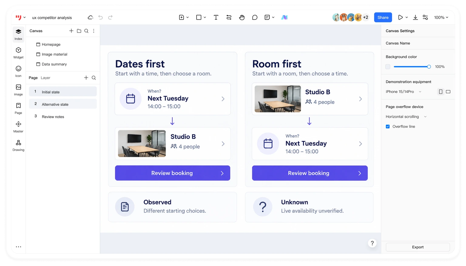
For each option, document the expected advantage and a possible drawback. For example: “Time first may narrow the room list sooner, but someone seeking a particular room may have to go back.” These are hypotheses to explore, not findings from a completed usability study.
Step 4: Preview and review the flow
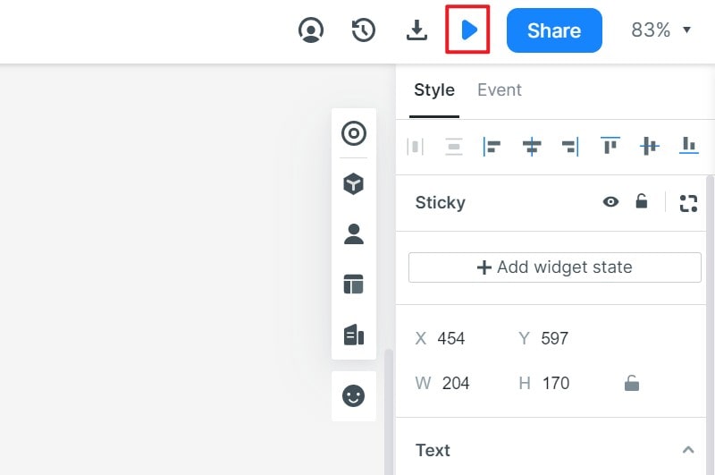
Preview from the starting screen and follow the full task. Check the normal route, changing a selection, and encountering an unavailable slot. Then share the prototype for review. A prototype helps people experience and discuss the proposed behavior; previewing it does not launch a booking service or prove that availability and payment are implemented.
When comparing alternatives with participants, keep their task consistent and record behavior separately from preference. Use the comparative prototype testing guide to plan the sessions. End the analysis with a decision, the evidence behind it, and the uncertainty that remains. That is a more useful handoff than a folder of attractive competitor screens.