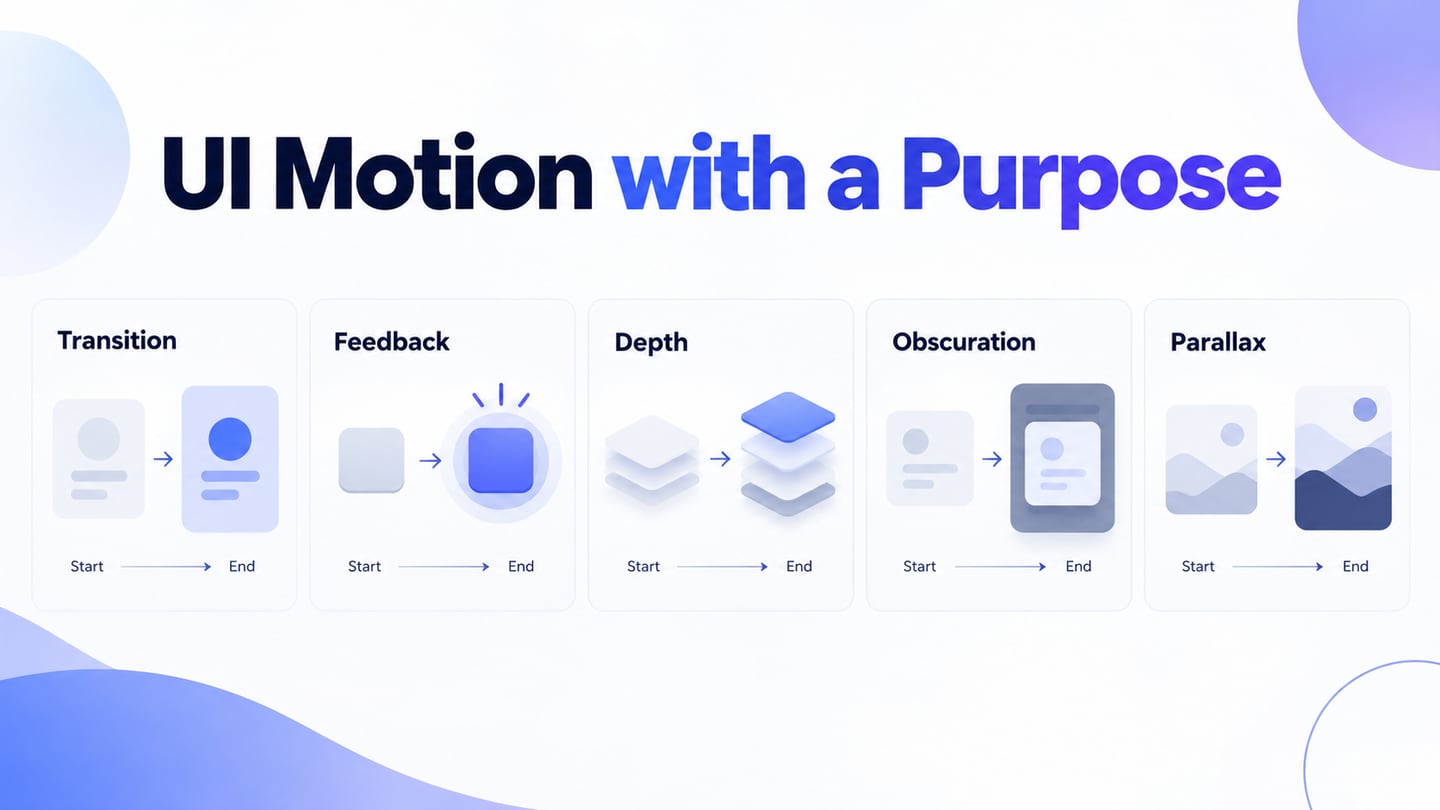
UI motion can explain a change of state, connect one screen with another or draw attention to feedback. It can also distract or make an interface uncomfortable to use. Begin with the information that movement needs to communicate, then decide whether motion is necessary.
Use an interactive prototype to discuss the trigger, starting state and result before implementation. The five types below help you choose a purpose for motion. The retained examples are historical illustrations and still frames; the images on this page do not reproduce their full timing or prove that the original animations remain available.
Placement matters, but so do timing, interruptibility and the way the interface works without nonessential movement. A transition that looks attractive in a demo may slow repeated tasks or make a state harder to understand. Check the whole interaction, including errors and reduced-motion behavior.
For each example, ask: what changed, what should the person notice, and can they understand the result without following an animation?
Five Types of UI Motion and Their Trade-offs
1. Easing the Transitions on Mobile
A transition can show how a destination relates to the screen the person just left. Keep it short enough that it does not hold up the task, and avoid moving unrelated content at the same time. Choose and test timing for the interaction rather than using one universal duration.
Decorative transitions borrowed from a slideshow, such as a star-shaped reveal, may obscure the relationship between screens. A useful transition gives a reason for movement: an item expands into its detail view, or a panel enters from the edge where it will later leave.
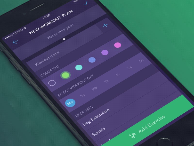
The workout-plan and loading-screen images above and below are historical frames. Use them to inspect hierarchy and continuity, then assess the actual transition in a working prototype. A still frame cannot show easing, latency or whether someone can interrupt a transition.

Loading-transition animation source
Moving a card can connect its previous and next positions, but several cards moving in different directions may compete for attention. Keep the relevant object identifiable and preserve a clear path back when the transition opens another view.
When content takes time to load, provide truthful feedback about the waiting state. Do not add motion simply to keep someone watching, and do not suggest that a task has completed before the system has confirmed it.
2. Use Micro-Interactions for Feedback
A micro-interaction is a small, focused interaction, such as activating a control and seeing its resulting state. Motion may make that feedback noticeable, but the state should also be understandable through text, shape or another appropriate cue.
Submit-button animation source
The retained Submit-button frame illustrates a control that could change after activation. The still image itself does not show successful submission. In a real form, distinguish pending, successful and failed states, and make the message available to assistive technology.
The feedback should describe the task outcome. A changing color or revolving shape can accompany a message, but it should not be the only way to tell whether an action succeeded. Keep the control’s role and the meaning of its states consistent.
The email-field example is another starting point for a focused interaction. Decide what happens for an invalid address, a server error and a successful submission rather than designing only the happy-path motion.
Pull-to-refresh, a toggle or a save action can each contain a small feedback loop. Their purpose is to communicate a change or response; not every micro-interaction needs animation.
For a reading-list example, the action Save should leave the selected item in a clear Saved state. A brief transition can connect the two states, while an immediate label change can communicate the same result when reduced motion is preferred.
3. Using Dimensionality in the Design
Dimensional motion suggests layers or surfaces, for example a panel opening above another view or a card revealing more detail. Use that depth to explain a relationship, not merely to add a three-dimensional effect.
Physical metaphors can make an action recognizable, but digital interfaces do not need to reproduce every physical constraint. Consider whether a fold, rotation or slide helps a person understand the task and whether a simpler transition would work.
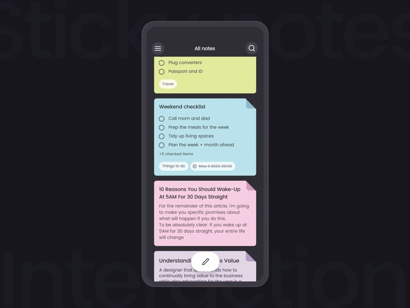
Layered-notes animation source
Turning a book page is a familiar metaphor, but a digital reading interface can also use an immediate page change. The retained notes and mobile-onboarding concepts illustrate layered content; they are not current product instructions or evidence that all readers prefer page-turn animations.
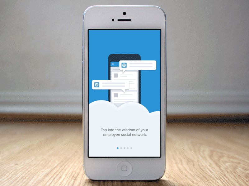
Original mobile-onboarding source: Hammockweb
A depth effect needs consistent ordering: the person should understand which view is active and what will return them to the previous context. Test that relationship with keyboard navigation and without relying on movement alone.
4. Obscuration and Frosted Effects
Frosted or translucent layers can suggest that content remains behind an active surface. As with glass-style interface design, legibility and contrast matter more than the visual effect. A blur is not by itself a motion effect; motion appears when the layers or their properties change over time.
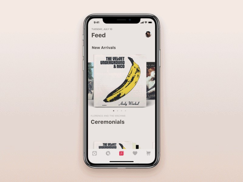
Album-interface animation source
Translucent desktop surfaces are a historical example of this visual approach, but their appearance depends on the operating-system version, theme and settings. Do not assume that an older example describes the current Windows interface.
When opening a foreground panel, preserve enough context to explain where it came from without making inactive content look interactive. Specify what can receive focus, how to dismiss the panel and where focus returns.
A music interface may connect the current item with the next one through a horizontal transition. The retained vinyl-shop concept shows layered album artwork; it is not a verified screenshot of current Spotify behavior.
If artwork shrinks or moves away, retain an unambiguous selected state and readable track information. Obscuring part of an item should not hide a control needed to pause, dismiss or reverse the action.
5. Parallax Motion
Parallax makes foreground and background elements move at different rates, suggesting depth. It can support a visual narrative, but it adds nonessential movement to scrolling and may be distracting or uncomfortable for some people.
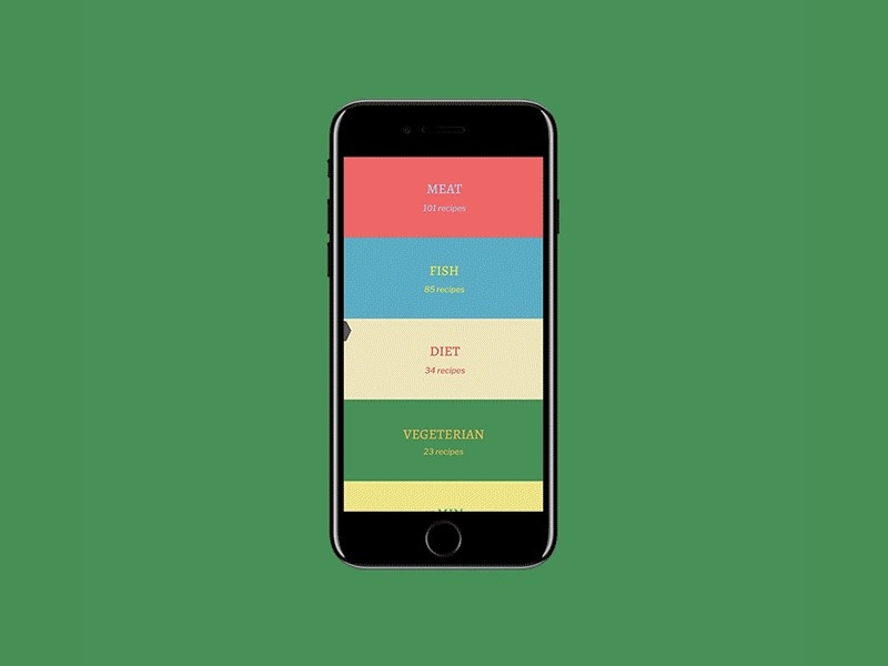
Recipe-category animation source
The recipe-category phone concept and illustrated restaurant page below show compositions often associated with parallax. These retained frames demonstrate visual layers, not the complete scroll behavior. Keep the content order and reading experience useful when those layers do not move.
Use parallax only when the spatial relationship contributes something relevant to the experience. A decorative effect should not delay access to the menu, article or task controls.
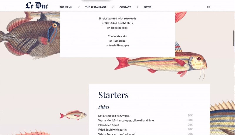
WCAG’s Animation from Interactions guidance explains the Level AAA requirement to let users disable nonessential motion triggered by interaction. Respect reduced-motion preferences and provide an alternative that still communicates the result. This is separate from requirements for automatically moving content.
Combining parallax with scaling, color changes and duplicate moving elements increases visual complexity. Evaluate the combined effect rather than assuming that each small animation is harmless in isolation.
These five categories are a way to reason about examples, not a fixed inventory of every kind of motion. For a more detailed workflow, see how to specify and review motion in a prototype.
Plan a Motion Example in Mockitt
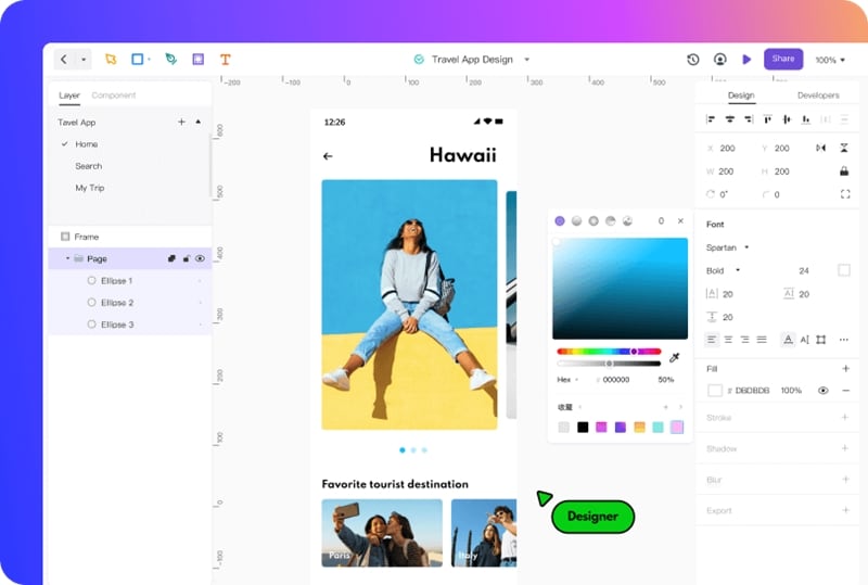
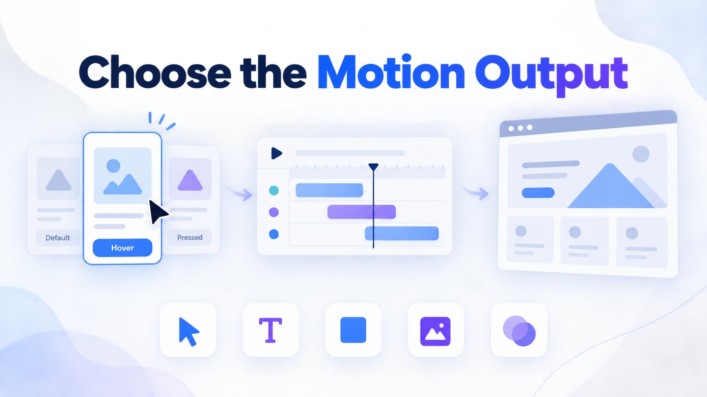
Mockitt can help you arrange interface states and discuss the path between them. Begin with a task and a result rather than choosing an effect first. The retained editor screenshot is a historical design example; it does not establish support for every motion technique described in this article.
For an illustrative reading list, create a card titled “A guide to clear navigation” with a Save action. In the next state, keep the same title and show Saved. Explain the trigger and the state change so a reviewer can follow the relationship.
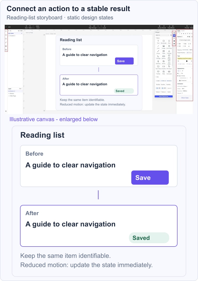
Keep the main control and title in consistent positions where possible. If the item moves to a Saved list, show where it went and how the person can find it again. Do not animate a disappearance with no meaningful confirmation.
Prepare a reduced-motion version that changes the state immediately. Both versions should communicate the same outcome. A prototype review can reveal confusing labels or missing states, while the implemented behavior still needs accessibility and device testing.
Use text, layers and reusable elements to create the beginning and end states, and use only the preview interactions supported by your current editor. An illustrated storyboard can communicate the intended relationship even when a particular effect has not been implemented.
Discuss the trigger, duration, easing, interruption and reduced-motion alternative with the developer. Treat visual effects such as masking or gradients as separate design properties rather than evidence that an editor generates production animation code.
For web implementation, web.dev’s animation-performance guide explains why transforms and opacity are often preferable to properties that trigger layout or paint. Profile the actual implementation on representative devices; a smooth editor preview is not a performance measurement of the shipped website.
Conclusion
Motion is useful when it explains a change that matters to the task. Keep the person oriented, make the result understandable and preserve control during waiting, errors and navigation.
Review the five example types with and without their effects. If removing the movement makes no information disappear, keep the simpler alternative available. The goal is an understandable interaction, not the largest collection of animated elements.