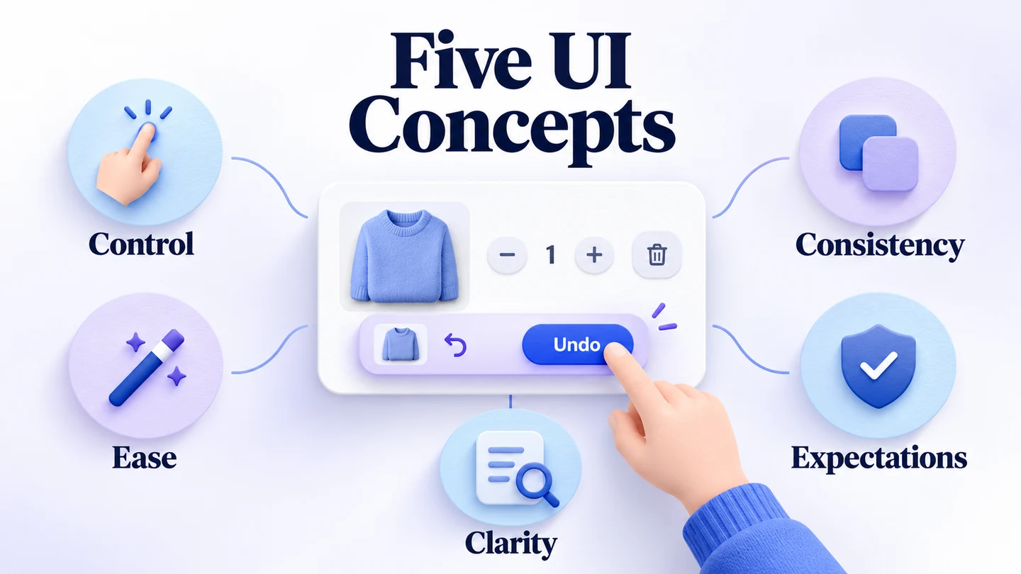
UI design concepts help turn an attractive screen into an interface people can understand and use. Five useful starting points are user control, low-effort interaction, manageable cognitive load, consistency, and respect for users' expectations. Each gives you a different question to ask about an everyday task.
UI work extends beyond websites and phones to other interactive products. Inspiration can suggest a layout or a visual style, but a concept still needs to fit its audience and purpose. You can explore variations in Mockitt Design, using components and shared styles to compare options without rebuilding every screen.
The examples below retain different kinds of interface inspiration: a cooking app, an expense concept, a historical call toolbar, and a design workspace. Use them to examine particular decisions, then test those decisions in your own context.
Top 5 Creative UI Design Concepts
There are no shortcuts or secret formulas for a successful interface. Visual design takes practice, and creativity benefits from a clear problem. Rather than copying an entire screen, identify what it helps someone do and how the design communicates the next action.
These five concepts are useful review lenses. They are not a ranking, and a design may need a tradeoff between them—for example, an extra confirmation can slow an action while helping prevent a costly mistake.
1. Make Users Control the Interface
Give users a sense of control over their progress. They should be able to recognize where they are, choose an appropriate next step, and recover when they make an ordinary mistake. This does not mean exposing every function at once: too many competing controls can make a simple task harder.
A comfortable interface supports learning through predictable behavior and useful feedback. People should not have to restart a whole task just because they selected the wrong option.
- Create reversible actions: offer Undo or a route back when the product can genuinely restore the previous state. Some actions, such as a completed external transfer, cannot simply be reversed; explain consequences and provide appropriate confirmation or recovery instead.
- Provide step-by-step guidance: for a longer task, show the current step and what remains. Let people review or change earlier choices without losing unrelated work.
Take a shopping cart with two items. After someone removes a mug, show “Mug removed” with an Undo action and update the total. Selecting Undo should restore that same item and quantity, then recalculate the total. If the product offers this action only briefly, make that limit clear and provide a usable way to recover; the word “Undo” must match what the system can actually do.
The cooking-app concept below offers another way to examine control:
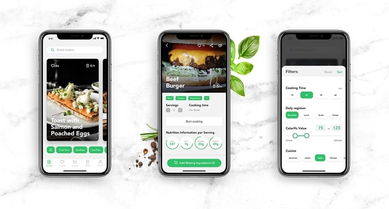
The visible recipe details and filters suggest useful choices. A screen image cannot establish whether navigation or recovery works, however. In a prototype, try changing a filter and returning to the recipe, then check whether the selected options remain clear.
2. Effortless Interaction with the Product
Reduce unnecessary effort by removing elements that compete with the current task. A simpler screen can help, but removing useful labels or hiding necessary options can create more work. The aim is to make the next action understandable, not merely to minimize the number of visible elements.
Review each piece of information in context: does the person need it to make this decision, or can it appear at a more useful point?
- Avoid repeated data entry: reuse information the user has already supplied when appropriate, while letting them inspect and correct it. Ask only for information needed for the task.
- Use familiar language: choose words the intended audience uses. “Migrate” may be clear in a technical tool and confusing in a household shopping app; wording needs context rather than a universal banned-word list.
Animation can explain a change, such as a chart updating after a date selection. It can also distract, delay a task, or cause discomfort. Keep motion purposeful, preserve the information when motion is reduced, and make sure users do not need to watch an animation to understand the result.
The concept provides a useful prompt for review: can someone find the period they need and connect the summary to its transactions? Motion and visual polish do not answer that question by themselves. Clear labels and an understandable selected state still do the essential work.
3. Reduce Psychological Load
Cognitive load is the mental effort involved in understanding and using an interface. Reduce unnecessary remembering and interpretation, especially when the task itself is demanding. Keep relevant information available, group related controls, and make the result of an action easy to recognize.
Before adding an element, consider what someone expects it to do and what information they will need afterward. In the cart example, showing the removed item's name in the feedback is more useful than a vague “Done.” It connects the message to the action the user just took.
Icons can help people scan a compact toolbar, but recognition depends on experience and context. This historical Google Hangouts example shows why the state of an icon matters:
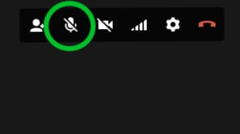
A person may recognize a microphone without knowing whether the control describes the current state or the next action. Nielsen Norman Group's guidance on icon usability explains why most icons benefit from visible text labels. Clear state feedback and accessible names also matter. Do not assume that a familiar-looking symbol is understood by everyone.
4. Consistency in Design
Consistency supports usability and learning because people can transfer knowledge from one part of an interface to another. Reuse the visual language of colors, type, icons, spacing, and controls where the meaning is the same. A primary action should remain recognizable as users move through a task.
Consistency also applies to behavior. If one dialog closes with Cancel and preserves the previous data, another similar dialog should not silently submit changes through the same action. In the cart, use the same removal feedback and restoration behavior for each item. A reusable component helps maintain the pattern, while review checks that its meaning is appropriate in each context.
5. User Expectations
People bring expectations from earlier experiences with apps, websites, and the platform they are using. Familiar patterns can reduce the work of learning a product. Expectations vary across audiences, so research and observation are more useful than assuming that every person thinks like the designer.
Follow relevant platform conventions and choose names that match the task. Calling a shopping cart a “shopping center” adds a new interpretation without a clear benefit. Similarly, a cart's Undo should restore the removed item rather than opening a help page. When you must depart from a familiar pattern, make the difference understandable and observe whether people can use it successfully.
Explore UI Concepts with Mockitt
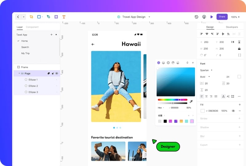
A design tool gives you a place to explore concepts, compare alternatives, and share work. It does not supply creativity or prove usability. Hands-on practice is useful: choose one existing task, change a specific decision, and explain what the alternative should improve.
For the cart exercise, make three states: the original cart, the cart after removal, and the restored cart. Keep the layout stable so reviewers can follow the change. Write the feedback before adding decorative motion, and agree on which quantities and totals should appear in each state.
Mockitt supports visual design and prototyping work in an online workspace. Use a shared review to gather comments on the specific decision rather than asking only whether someone likes the screen. For example, ask a reviewer to remove the wrong item and recover from the mistake. Their actions and explanation will tell you more about control and clarity than a preference for a color palette.
Features of Mockitt
The following capabilities can support this kind of exploration:
- Interface design: arrange screens with templates, reusable components, and shared variables to compare layouts and maintain consistent styles.
- Flow diagrams: map the action, resulting state, and recovery route before refining the screens.
- Vector design: create or adjust interface shapes and icons when the concept needs a custom visual element.
- Interactive prototypes: connect screens and actions to review the intended sequence. A clickable prototype demonstrates behavior; it does not replace a working application's implementation.
- Cloud collaboration: share work and collect comments with teammates who have access to the project.
Where design-to-code export is available, treat its output as a draft for development review and adaptation. The team still needs to implement and test application logic, accessibility, and integration. To develop the behavior behind these concepts further, explore interaction design alongside the visual work.
Put the Concepts into Practice
Choose a small everyday task and use the five concepts to inspect it from different angles. Can people control their progress, avoid unnecessary effort, understand the information, reuse what they have learned, and predict the result? Improve the weakest part, then observe the task again. A useful concept earns its place through the experience it supports, not simply because its appearance follows a trend.