What Exactly is Semantic-UI?
Semantic UI is a front-end framework that combines CSS classes, HTML structure, and JavaScript behaviors to build interfaces. Its descriptive class names help developers express a component’s purpose and appearance in markup. It is a coding framework, not a visual prototyping application. Before implementation, you can use Mockitt to prototype an interface flow and specify the states that a developer will need to build.
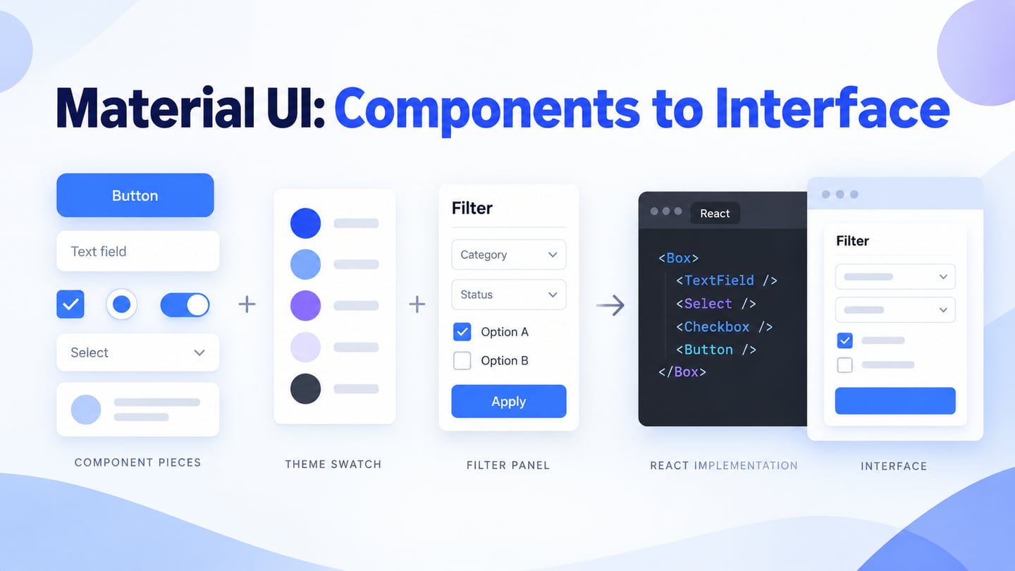
The official Semantic UI documentation groups components into Elements, Collections, Views, Modules, and Behaviors. Start with the documented markup and dependencies for the component you need, then test the result within your application. The retained homepage screenshot shows an older 2.4.2 release; it should not be used to choose a current package version or installation command.
What Can You Do with Semantic-UI?
Semantic UI provides styled building blocks for forms, menus, content displays, dialogs, and other website interfaces. Developers compose these pieces in HTML and configure behavior where required. Knowing HTML, CSS, and JavaScript remains important: the framework does not decide the content hierarchy, application data, or error handling for you. Responsive styling still needs testing with the actual content and supported viewport sizes.
For a React project, distinguish the original Semantic UI JavaScript components from Semantic UI React. The React library describes itself as jQuery-free; it provides React components, while the required styles are a separate setup concern. Follow that project’s usage instructions rather than combining an old jQuery initialization example with a React component that manages its own state.
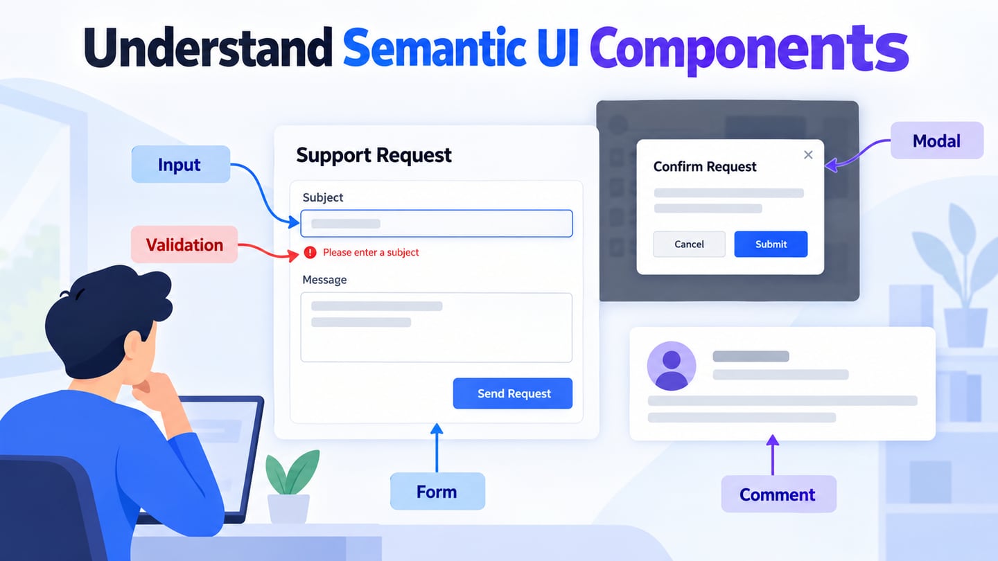
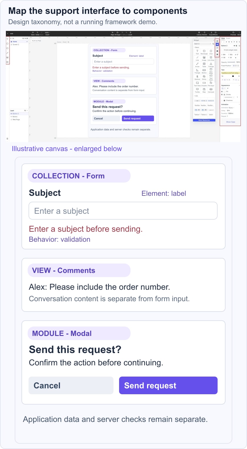
The five categories below describe different jobs in the interface. For an illustrative support-request flow, identify the visible content, related controls, and behavior separately. A label explains a field, a form groups the inputs, a comment view displays a conversation, and a modal can confirm an action. None of these pieces replaces validation or application logic.
Elements
Elements are basic interface building blocks, including buttons, containers, icons, headers, labels, and images. In the support example, a “Send request” button identifies the action and a text label identifies the subject field. An icon can support recognition, but it should not replace an essential label without an accessible equivalent.
Collections
Collections group related elements into larger structures such as forms, menus, tables, and grids. A support form combines labels, fields, and an action; a grid organizes their layout. Review the reading order and narrow-screen behavior rather than assuming that a grid alone makes the form usable.
Views
Views present a type of content, such as a feed, comment thread, card, or list of items. A comment view can display the support conversation, but it does not create a messaging backend. Specify the empty state, author information, and long-message behavior that the application needs.
Module
Modules add interactive interface behavior. Examples include modals and accordions. Define what opens the component, how someone closes it, and where focus returns. The selected framework implementation still needs keyboard and assistive-technology checks; a prototype only communicates the intended interaction.
Behavior
Behaviors provide functionality that can work with other components, such as form validation. Describe which input is invalid and how the person can recover. For the support form, an empty subject should produce a specific message near the field. Client-side validation is a usability aid; server-side checks remain necessary in the application.
Semantic UI Vs Mockitt app
Semantic UI and Mockitt serve different stages of the workflow. Semantic UI helps implement a web interface in code. Mockitt helps a team design screens, connect states, and discuss the proposed experience before or alongside implementation. Choosing a prototype tool does not remove the need for a front-end framework, engineering, or production testing.
In a prototype, assemble the support form, the conversation view, and a confirmation state. Note the intended component category beside each part so the developer understands the design decision. The prototype is a specification to review, not a guarantee that its components map directly to Semantic UI packages. For another implementation approach, compare the widget-focused role of jQuery UI.
Plan a Semantic UI Interface in Mockitt
Mockitt provides a visual workspace for planning an interface. Use it to explore the form hierarchy and how a person moves from a draft request to a confirmation. Keep the prototype focused on questions that a screen or interaction can demonstrate; backend behavior and deployment requirements need separate engineering work.
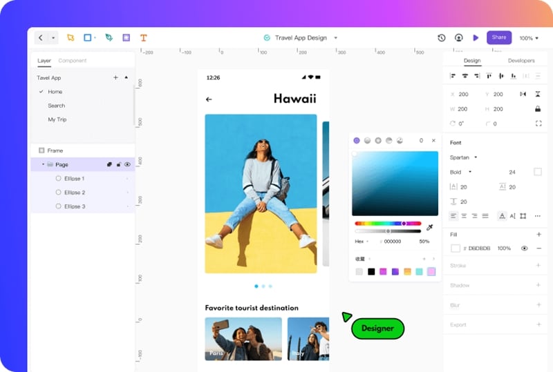
Place components on the canvas and adjust their visible properties. Connect the relevant screens or states, then preview the path. A reviewer should be able to identify the next action and understand an error without the designer explaining it. The historical editor screenshot below illustrates visual editing; current controls may differ from the archived interface.
Features of Mockitt app
- Simple Interface
Start with a small set of screens and a clearly named goal. For example, create a draft support request, an invalid-subject state, and a confirmation. Keep annotations separate from user-facing copy so reviewers can distinguish instructions about the design from content intended for the application.
- Awesome Asset Library
Use available icons, widgets, and templates as starting points. Adapt the labels, dimensions, and visual states to the task. Reusable components can support consistency, but the prototype’s asset library is not the same thing as a production Semantic UI component library.
- Easy Handoff
Share the proposed interface with developers together with state descriptions, content rules, and unresolved questions. A useful UI development handoff identifies what changes after each action. It should also state which behaviors are simulated and which need implementation.
- High-end Collaboration
Share a preview with the relevant reviewers and check its access settings. Ask focused questions about labels, hierarchy, or missing states. Record decisions and update the same prototype version so feedback does not refer to an obsolete screen.
- Powerful web elements
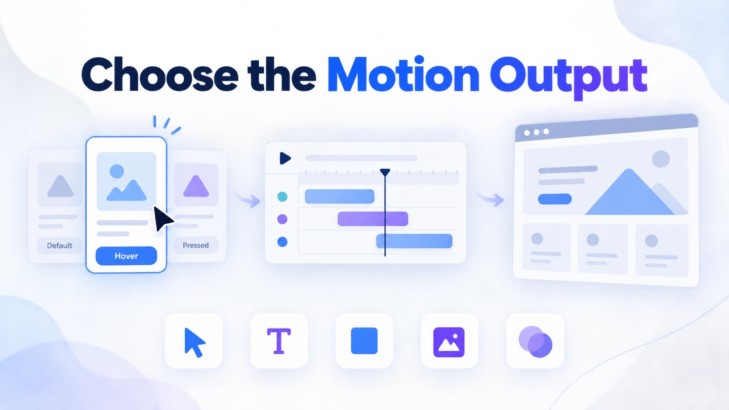
Use connected states to explain interactions that a static screen cannot show. Keep the support example’s validation message and confirmation distinct. Animation may help explain a transition, but decorative motion is not a substitute for clear feedback or an accessible implemented control.
Review the prototype with realistic content: a long subject, a missing required field, and a conversation with several messages. Then test the implemented page separately for layout, keyboard access, validation, and performance. Visual design and a functioning website are related deliverables, not interchangeable results.
Conclusion
Use Semantic UI when its documented components suit your application and your team can support the implementation. Use a prototype to agree on the interface before committing to those components. The practical sequence is to define the task, model the important states, review the flow, and verify the coded result. Consult usability testing methods when you need evidence about how people complete the task.