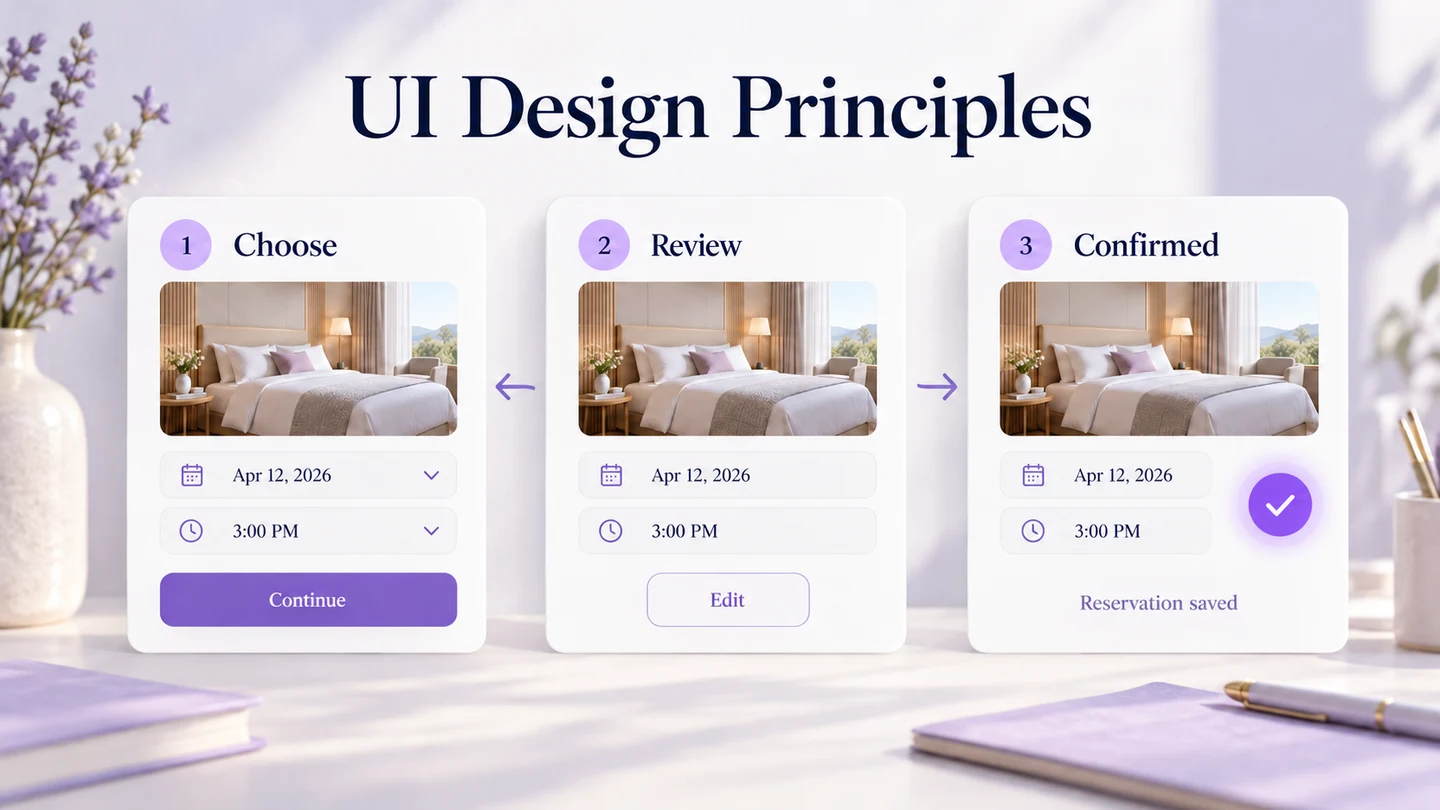
Five useful user interface design principles are to keep users in control, use familiar and consistent behavior, make navigation clear, confirm completed actions, and reduce what people must remember. Apply them to the decisions in a real task, not just the appearance of a screen.
A UI design tool can help you explore these choices, but attractive visuals do not automatically make a usable interface. Creating a useful design depends on your audience, their tasks, and the setting in which they use the product.
However, while including all the variables, there are a few principles of user interface or golden rules to create the designs and guide the designer to follow the ideal set of fundamentals.
Top 5 Golden Rules of UI Designing
1. The User Shall Have the Control of the Interface
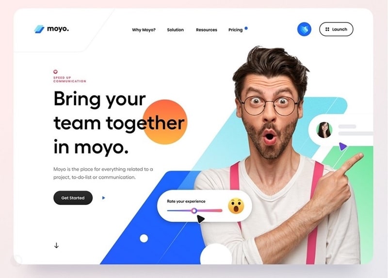
Even though you are the creator of the interface, users need meaningful control over their actions. Make it clear how to start, stop, revise a choice, or leave a flow. The interface should provide control, not merely make people feel that they have it.
Source: Geniusee
They will learn it faster and feel comfortable engaging with it. Another way to make the users feel that they have total control over the interface is by making actions reversible. This can help them explore the interface with more confidence. For actions that cannot be undone, explain the consequence before they commit.
On the contrary, imagine working with an interface where you have to take any action diligently because there is no coming back from making a wrong choice. While designing the interface, also make sure that you place the reverse function in the right places and while conforming to the platform.
For instance, an edge-swipe may take an iPhone user back through a navigation stack. Going back is not the same as undoing a saved change or reversing a payment. Follow platform navigation conventions, and make cancellation, editing, and undo behavior explicit where the task needs them.
2. Natural, Consistent, and Friendly
These are three different principles of user design interface merged into one golden rule that you should always keep in mind.
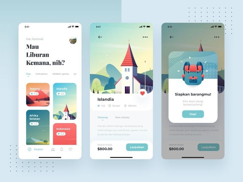
- Naturalness: A natural user interface is one that does not force the user to think about what they have to do next. In other words, the users have become habitual of using an interface in a certain way.
When you design an interface that requires additional explanations or works from the user's end, it won't be a natural experience, which can be hurting the business or brand value.
Source: Pinterest
- Consistent Behavior: This principle aligns with the previous in that it instructs the designers to keep the core of the design similar to the user's current knowledge.
Users transfer knowledge from familiar interfaces. Keep command names and control behavior consistent when they mean the same thing. A deliberate change may be appropriate, but it needs a clear reason and should remain understandable.
For instance, a primary action should appear where a user has enough information to choose it. Contact information is often available in a footer, but that does not make the footer its only valid location.
Test whether people can find the information and action in context. Consistency should reduce effort without forcing every page into the same arrangement.
- Friendliness: Friends are supposed to forgive each other, yes. Well, you need to apply the UI principle of forgiveness while creating the interface and let your users revert an action by first warning them about the consequences.
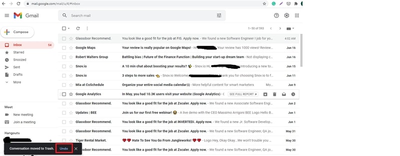
A friendly interface is the one that will look to prevent situations a user can run into. So, the rule here is to understand your user and predict the actions they can take regarding your interface. Instruct them about the same and warn them while giving them the option to go back in case of a wrong decision.
3. It Should Be Easy to Navigate
Another important UI design principle is that your design must be easy to navigate. The navigation must always be clear, fast, and self-explanatory. Do not make users guess what an action button or navigation control will do.
The goal here is not to intimidate the users with clingy designs and complex triggers. Follow the KISS formula here as it is another one of the principles of user interface designers must understand.
An easy-to-navigate interface has two useful features:
- Visual Cues: You need to make it clear to the user about where they are and what they are interacting with. Give them indicators that will help them navigate easily through the interface.
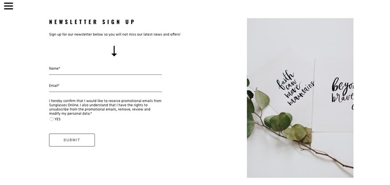
Image credit: Medium.
- Prediction: Give your users a way ahead sort of feeling when they use the interface. For example, when you buy a product or build a profile, there are headlines on the top which depict the process. It helps the users know what lies ahead when they will click on the Next button.
4. Give them a Closure
Another one of the golden rules of the user interface is about giving your users closure to their interaction. The sequence of actions must be arranged in a manner that they have a beginning, middle, and end.

Historical Amazon screenshot; original image credit: Meme.
This is the kind of informative feedback that your users would like to have and know that there is nothing for them to do ahead. As an example, when you buy a product online, you are given cues, predictive elements, and a final "Thank You For your Payment or Order" in the end. This indicates that they can now move forward.
5. Don't Let Users Use Their Memory
The critical point here is not to let your users think about what they did or entered in the previous page or window. Since humans have a limited capacity to remember things, you need to avoid building interfaces that force your users to put information in different places.
They should not have to re-enter the same information in various places or fill out an answer to move forward again and again. For a longer form, group related questions into manageable steps and keep earlier answers available for review. A single page is not always easier than a clear multi-step flow.
These five themes draw on established interaction-design guidance; they are not the complete set of Ben Shneiderman’s eight golden rules. Use them as questions to apply to a particular task, then review the design with the people who need to use it.
Apply the Principles in Mockitt
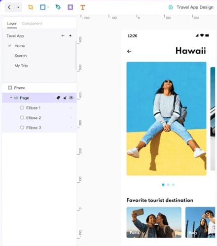
Mockitt combines interface design, prototyping, and other visual collaboration workflows. Its canvas and components let you turn a proposed interface into something a team can review.
Most of all, Mockitt Design keeps things simple, fast, convenient, and effective. Starting from the toolbar to the canvas, layering, and all the way to sharing or exporting the design, it is quite an experience you will get while working with this tool.
In terms of the principles of the user interface, let's relate how Mockitt can align your designing practices with the golden rules that we have discussed above.
- You need to build an interface that the user controls. To do that, the basic requirement is adding all those elements which are triggered by the user, and then they give a response.
For instance, give a gallery clear previous and next controls and show which image is selected. Keep the interaction understandable before adding motion; an effect is useful only when it helps the task.
- With Mockitt's design preferences, you can frame out a structure that resembles the natural state of a website embedded in a user's mind. However, with Mockitt, you can add to that design and make it look more appealing while retaining its natural state. You can create a draft and use the canvas to insert every type of shape and element you want in the design.
- Mockitt provides templates, components, and shared resources you can adapt for your work. Reuse a component when its meaning and behavior are consistent; verify the interaction in the flow instead of assuming that a template supplies it.
As a result, Mockitt is your one-stop solution to build user interfaces that are well in line with the design principles. It adds to your creative side, complementing it with the technical dominance proffering an all-in-one solution UI designing.
Example: Review and Change a Reservation
Consider a fictional coworking-room reservation. A person selects a room and time, reviews the booking, then receives a confirmation. Keep the existing five principles in view as you sketch the flow:
- Control: Place “Change time” on the review screen. Let the person revise that choice without losing the room and attendee count. If cancellation becomes restricted after a deadline, state that before confirmation.
- Consistency: Use the same room name, time format, and action labels on the selection, review, and confirmation screens. Do not change “Confirm reservation” into “Continue” on the final step.
- Navigation: Make the current step clear and provide a route back. Distinguish going back to edit from canceling the whole reservation. A clear navigation design makes those different consequences easier to understand.
- Closure: After a successful booking, show the room, date, time, and reservation reference together. If the request is still pending, say so; a loading state must not look like confirmation.
- Recognition: Keep the chosen details visible at review. If the selected time becomes unavailable, retain the other details and offer available times rather than making the person begin again.
In Mockitt, create the selection, review, confirmation, and unavailable-time states. Reuse the room-summary component and connect the actions needed to move between these states. Ask a reviewer to change the time and recover from an unavailable slot. Record where the proposed flow leaves them unsure; this exercise does not claim that a production booking system has been tested.
For visual adjustments within each screen, use the UI design tips on hierarchy, spacing, and contrast. A clear layout and predictable behavior support each other.
Conclusion
Review a complete task, including a changed choice and an unsuccessful action, against the five principles. Use the resulting questions to revise the flow so people can understand their options, recover when needed, and recognize when the task is complete.