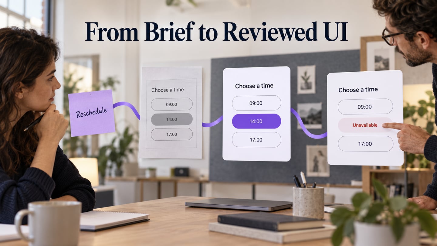
Photoshop can help you develop the visual details of a user interface: layered imagery, masks, typography, and static screen compositions. It is useful to distinguish that work from interaction prototyping. This guide starts with Photoshop’s document and layer workflow, then uses editable UI design in Mockitt to review a screen and its related states.
How to Make UI Design with Photoshop?
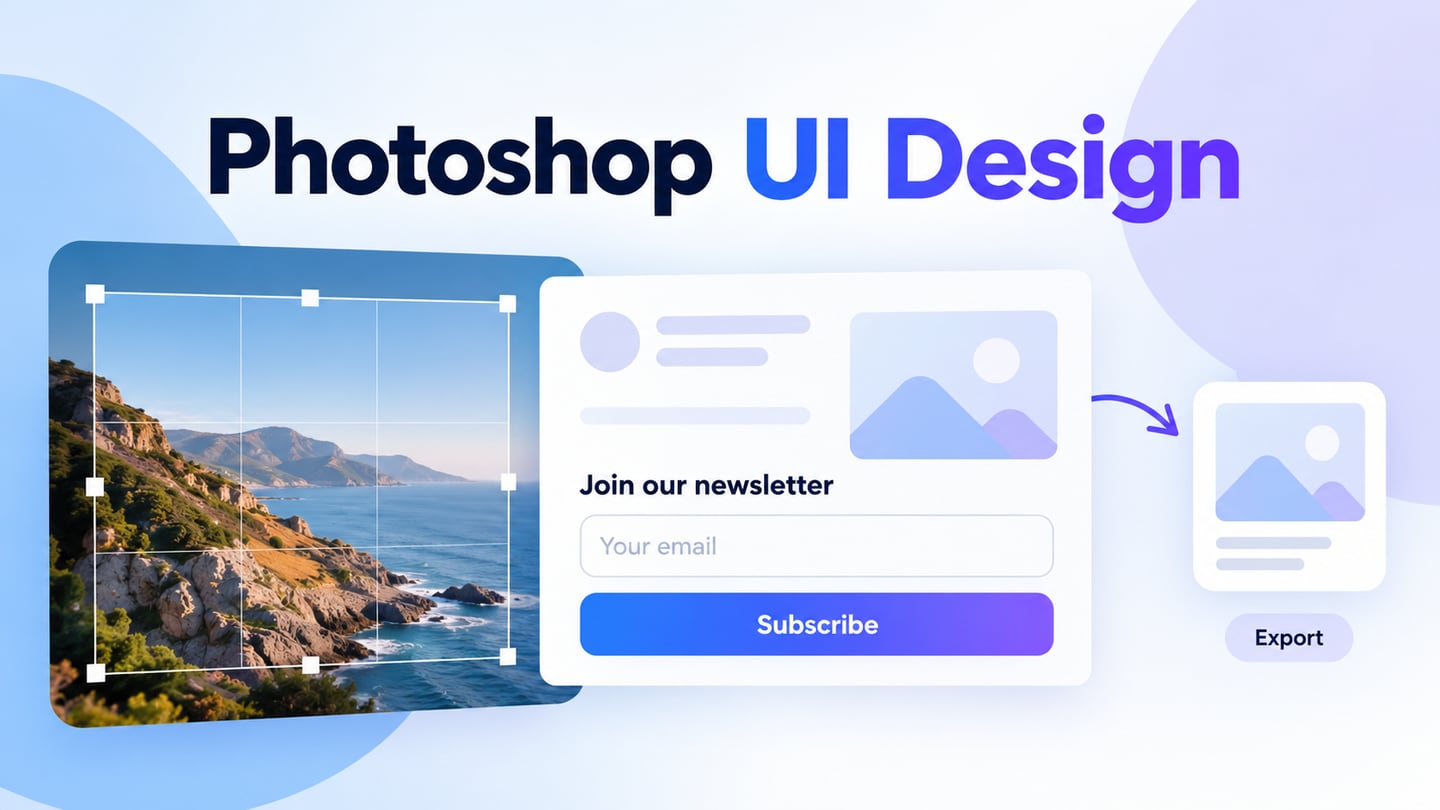
Begin with one screen and a clear visual task. For this example, design a newsletter sign-up screen with a heading, image, email field, and submit action. Keep an editable master file so you can revise the hierarchy and image treatment without rebuilding the composition.
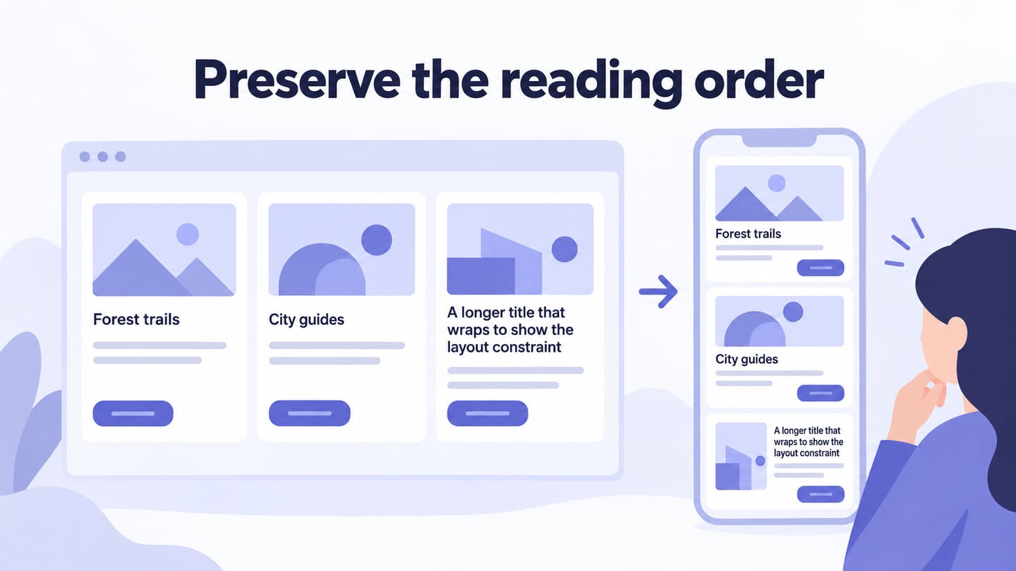
If your immediate task is only layout and content order, the Photoshop wireframe guide covers that lower-fidelity stage. Here, focus on visual details that are worth reviewing: the image crop, text contrast, input boundaries, and spacing around the form.
- Know your layers: A document or artboard defines the screen area; individual layers hold text, shapes, or images within it. Do not size each layer as though it were a separate device screen. Photoshop’s artboard document workflow lets you create a document with artboards, then organize screen content in layers and groups. Name groups by their purpose, such as Header, Form, and Illustration. Set the artboard dimensions for the intended viewport and use guides to align the content. Artboards do not automatically turn a composition into a responsive website.
- Use a layer mask to control visibility: Keep each screen’s layers organized together, then use a mask when you need to hide part of an image without deleting it. A mask does not merge the layers. In Adobe’s layer-mask workflow, white reveals, black hides, and gray makes the masked content partly visible. Select the mask thumbnail before painting so you do not accidentally edit the image itself. For the sign-up example, mask the image to its intended container and check that it still reads clearly at the display size.
- Add components: Add the text, shapes, and imagery the task needs. Use a readable hierarchy for the heading, label, input, helper text, and action. Less text and wider images are not universal rules: the form still needs enough explanation for someone to understand what they are joining. Raster images can pixelate if enlarged beyond their usable resolution, so inspect the exported result at its intended size. Use suitable vector or shape assets where crisp scaling matters, and confirm that you have permission to use logos or illustrations.
- Vector assets can provide custom shapes or logos. For example, you can prepare a suitable asset in Adobe Illustrator and bring it into the composition, checking the resulting size and clarity.
- Save and export: Save the editable design as a PSD, retaining the layers you need for revision. Export an appropriate image format for review and check its size, compression, and transparency where relevant. A PNG or JPEG communicates a static screen; it does not create form validation, responsive layout, or a working submit action.
Review the Interface States in Mockitt
After composing the visual screen, review how its states relate to the user’s action. Mockitt offers editable screens and interactions for that discussion. Rebuild the relevant layout with widgets or use supported assets; do not assume that a Photoshop file will become a fully editable prototype through automatic import. The original image below is a historical Mockitt travel-app example, not a Photoshop screenshot.

Useful Capabilities for the Review
- Check the current plan for project, collaboration, and export limits before choosing a workflow.
- Use built-in widgets, templates, and icons as starting points, then adapt them to the task. Save reusable widgets when the same element appears on multiple screens.
- Drag widgets onto the canvas and adjust them to the layout.
- Connect pages with supported triggers and transitions to explain what happens after an action.
- Keep work in an accessible shared workspace and use the available version or backup practices; cloud storage is not a guarantee against all data loss.
- Invite the relevant designers, developers, and product teammates with the appropriate project permissions.
Here are the steps to create UI design in Mockitt :
Step 1: Create a new project
- Choose ‘Create Project’ after logging in successfully.
- Choose a new project with the required device type and size.
Step 2: Design the Form and Its States
Add widgets and icons
- Many components are available on both sides of the screen. ‘Fast Widgets’ on the left and ‘Build-in Widgets’, ‘My Widgets’ and ‘Icons’ on the right.
- The desired widget can be chosen and dragged to the canvas from the panels.
Add links between screens
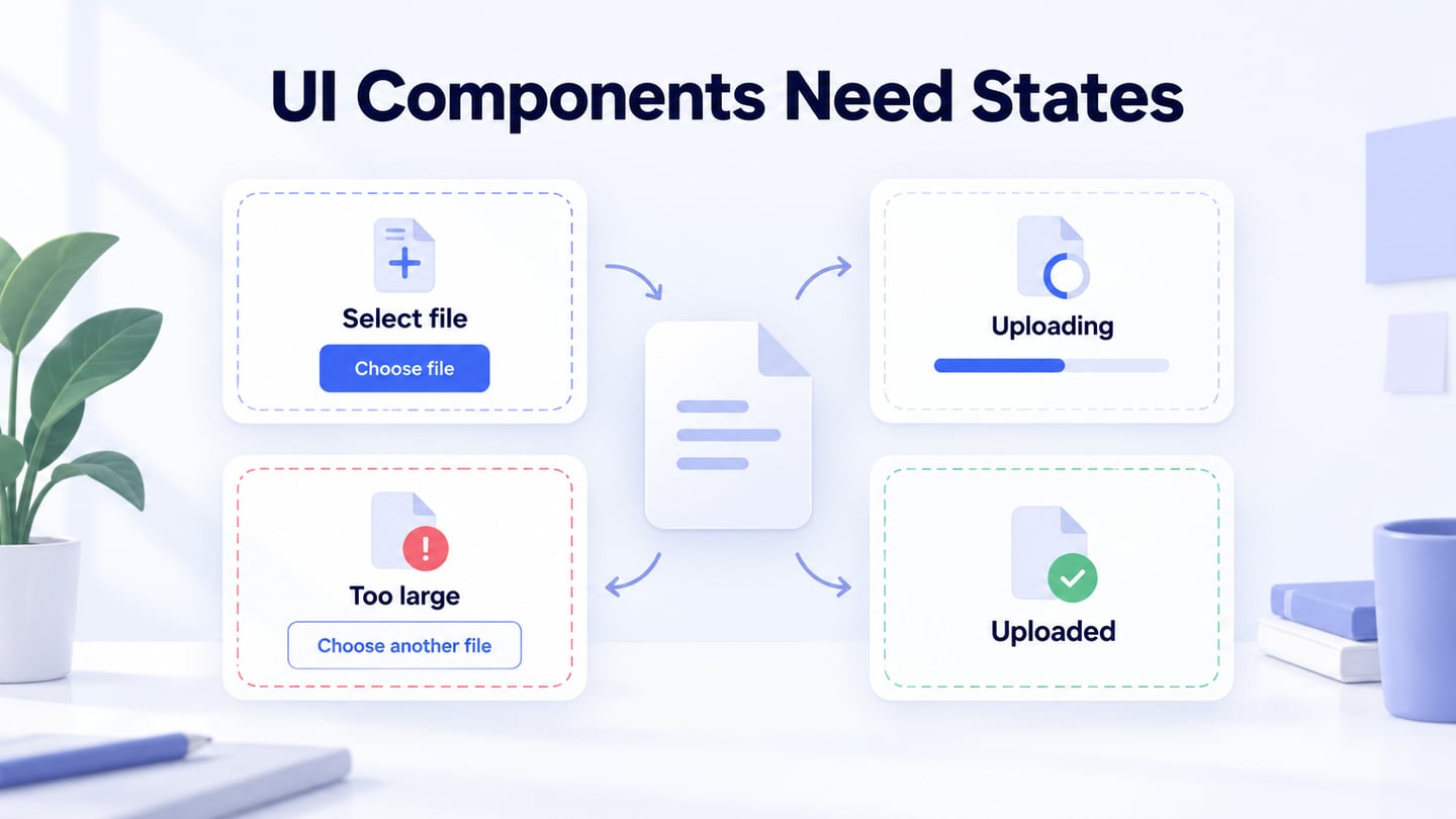
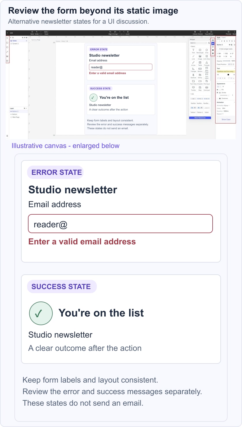
Configure the form’s action and target through the interaction controls. For the newsletter example, prepare a success state and a separate invalid-email state. Use a deliberate preview path or available widget behavior to demonstrate each one; a prototype does not subscribe the address to a mailing list.
In this illustrative newsletter example, the error state says “Enter a valid email address” near the field, while the success state says “You’re on the list.” These are alternative design states for review, not evidence that an email was validated or sent.
- Choose ‘New link’ from the right panel to set a gesture, action or animation.
- If the design includes media, verify the supported format and its behavior in the shared preview rather than assuming any external URL will embed correctly.
Add Notes
Record what the reviewer should notice and which behavior remains to be implemented. For example, note where validation feedback belongs and which text changes after a successful submission.
- Keep notes alongside the relevant screen so open questions remain visible during review.
Create interactive states
Use supported widget or screen states to show a change after the action. Keep the email label, field position, and button placement consistent across the example so the reviewer can focus on the feedback rather than a moving layout.
- Use an appropriate library item or template as a starting point, then adapt it to the form.
- Use dynamic widget states where appropriate to demonstrate a component changing within the same screen.
Step 3: Preview your UI design.
- Preview the sign-up screen at the target size. Check that the field has a visible label, that error feedback explains what needs correction, and that the success state clearly confirms the outcome represented in the prototype. Compare those states with the static Photoshop composition to see which visual details need refinement.
Step 4: Share your UI design
- Share the reviewed screens and document the intended states with the implementation team. Include assets, spacing, and behavior notes that help a developer understand the decisions. For a wider tool comparison, Figma versus Photoshop separates interface workflows from image-editing tasks; the appropriate tool depends on the work, rather than a universal winner.
- Include the developers and designers who will implement and maintain the interface, with permissions appropriate to their role.