Game UX refers to a player’s experience of understanding, controlling, and progressing through a game. It includes gameplay, menus, feedback, settings, and recovery from mistakes. Mockitt’s online prototyping tool can help you review the menu and interface parts before development. It is useful for exploring a player’s path through screens, but it does not simulate a game engine, real-time physics, network latency, or controller support in a shipped game.
5 Tips to Improve Game UX
The UI gives players visible controls and information, while the broader experience includes pacing, rules, feedback, and accessibility. Good game UI design supports that experience instead of trying to explain every mechanic at once. The five tips below focus on tasks you can examine in an interface prototype, then verify again in the playable build.
Understand your target users
Knowing the needs of your users allows you to choose the right tasks and level of support. Be more specific than an age or gender range: consider familiarity with the genre, input device, reading distance, and access needs. Observe a player starting a session, changing a setting, or recovering from an error. Ask what they expected before explaining how the interface works.
Focus on the UI aspect
Interface feedback should make the result of an action clear. A selected button, a short transition, or a sound can help, but movement is not mandatory for every control. Pair important audio with a visible signal and keep keyboard or controller focus distinguishable from a permanent selection. Avoid making players wait for decorative animation before they can continue.
User flow should be seamless
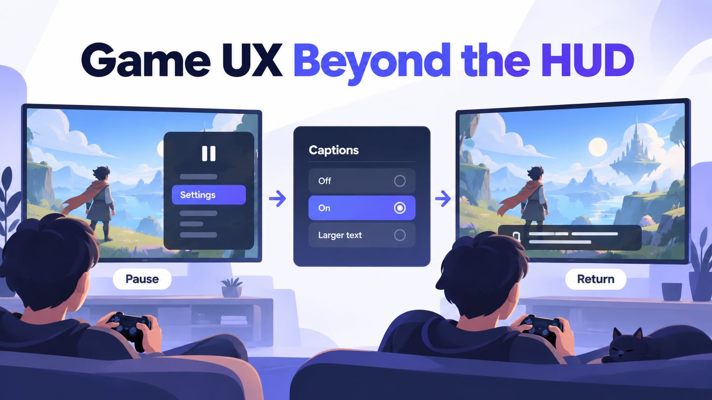
Think about how the player reaches settings, changes an option, and returns to the game. Do they need unnecessary navigation steps? Does Back preserve the previous choice, and does Resume return to the intended place? A simple game wireframe can expose these problems before artwork and effects make the screens harder to change. Visual effects such as rain and dust are separate from this navigation test.
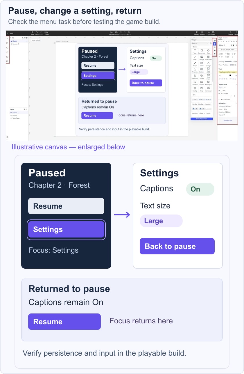
Use a small pause-menu task: open Settings, turn captions on, return to the pause menu, and choose Resume. Record whether the choice remains on, where focus returns, and whether the player understands what will happen next. A menu prototype can show this intended sequence; persistence, input support, and pause behavior must still be tested in the game build.
Iterate and Remove Unnecessary Steps
When you conceptualize a game, you often start with a confusing mess of ideas generated by several stakeholders. The UX designer’s job is to distill the best of it and craft it into a compelling game from the moment the app is opened until the time it is closed. Even a lot of your own design ideas might not make it to the final prototype; don’t worry, that’s the natural process at work.
Follow popular design conventions
Familiar conventions can reduce the amount a player must learn, but copy a convention only when it fits the device and task. Make actions such as Back, Cancel, and Resume consistent across menus. Xbox Accessibility Guidelines provide practical checks for text, contrast, input, navigation, focus, and motion. Treat those checks as design guidance, not as proof that a prototype or game is compliant.
Prototype Game Menus and Feedback in Mockitt
Mockitt can help you arrange a game-menu concept, connect screens, preview a path, and discuss it with the team. Use it for questions such as whether players can find captions, understand a confirmation dialog, or return from a settings page. The original screenshots below illustrate linking, preview, and inspection using a travel prototype; they are historical editor examples, not a running game.

Assets: Use reusable widgets and icons as a starting point, then give game actions specific labels. Keep menu items consistent across the pause, settings, and confirmation screens. Shared assets help the team discuss the same patterns.
Drag and drop: Arrange pages and elements visually. Start with the small task you want to test instead of building every menu. This keeps the prototype understandable for reviewers and makes changes easier to compare.
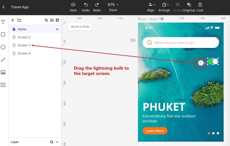
Widget linking: Connect a control to its intended target screen, then preview the path. The historical screenshot shows a link handle dragged to another screen; the current editor’s controls may differ. Verify both the forward action and the return path.
Screen states: Represent meaningful states explicitly, such as captions off and captions on. Name them clearly so the team can distinguish a visual option from a saved preference.
Widget states: Where the editor supports a component-state interaction, use it for a small change such as an expanded settings group. Separate screens are also a useful way to explain the same intended states.
Preview: Share the prototype for a focused review and check it at the intended screen size. A mobile browser preview can reveal cramped labels, but it does not establish that the final game supports every device or controller.
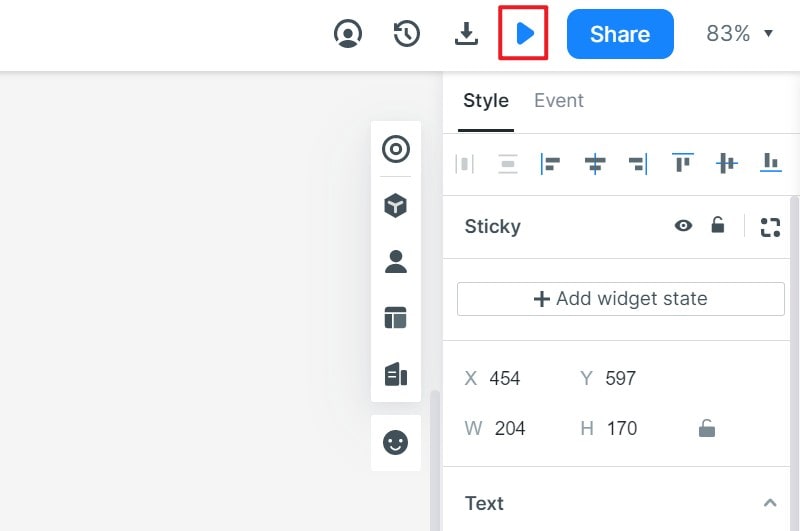
Shared workspace: Keep the current menu concept and review notes together. Check access permissions before sharing a link, and tell reviewers which task and revision they should examine.
Co-editing: Coordinate work on shared screens and agree who owns each change. Collaboration features help a team review the same concept, but they do not eliminate conflicting design decisions.
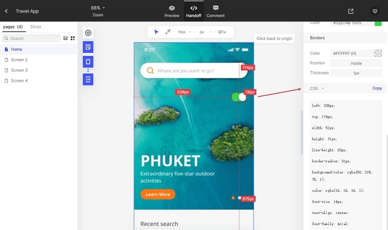
Handoff: Provide developers with the screen states, labels, assets, and behavior notes. Specify focus, Back behavior, and what happens when saving fails. A prototype and its available inspection data are design references, not a complete game implementation or automatically generated gameplay code.
End the review with an observable question: can a player complete the task without explanation, and do they understand the result? Use usability testing to improve the menu, then validate timing, performance, accessibility, and persistence in the playable build.