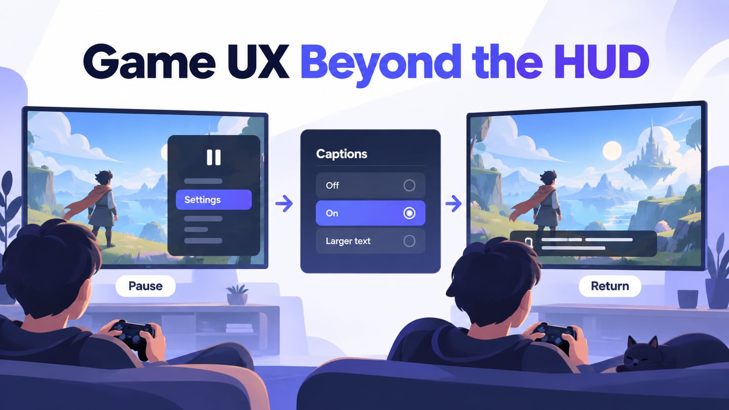
Game UI helps players understand the current situation, available actions, and results of their choices. It includes menus, inventory, prompts, feedback, and the heads-up display, not only decorative graphics. Start with UI components for menus and player controls and the decisions they need to support. A visually immersive interface still needs readable text and understandable interaction.
What Is Game UI, and What Should It Help Players Do?
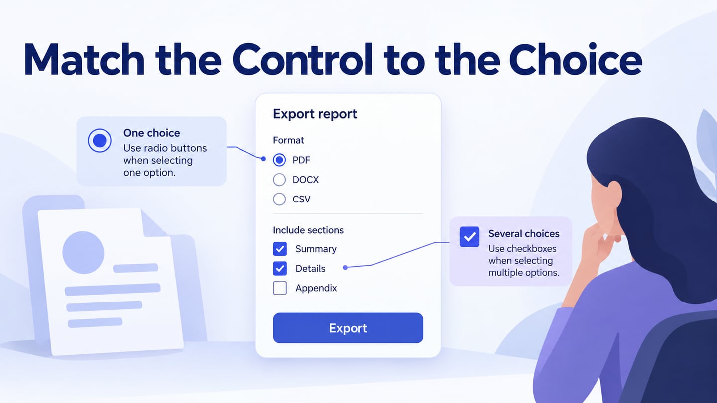
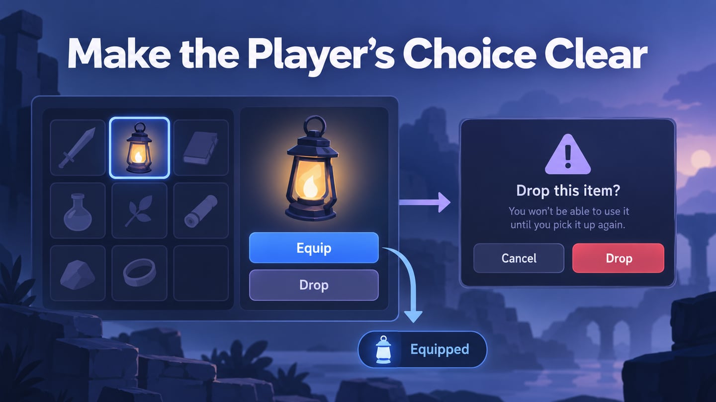
The interface connects the player’s intention with the game’s response. A menu selection may change a setting, an inventory action may equip an item, and a prompt may explain an available interaction. Make the selected state, permitted action, and result distinguishable. The same action may need different prompts for a keyboard, controller, or touch interface.
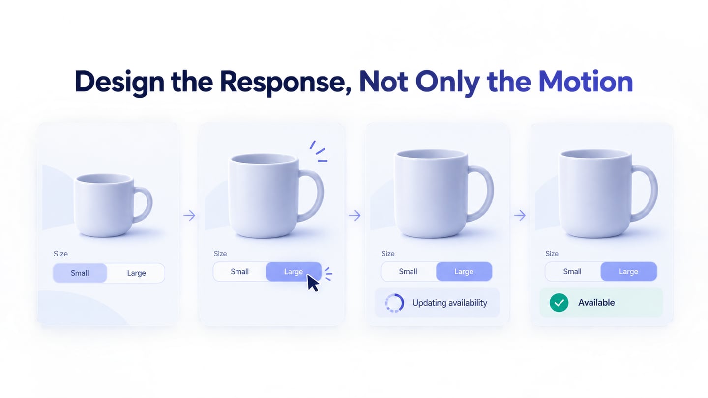
Animation can communicate feedback, but more animation does not automatically improve usability or increase purchases. Prioritize whether the player can read the information, understand the controls, and recover from a mistake. Microsoft’s game text-display guidance explains why viewing distance, screen size, and configurable text presentation matter.
Use Mockitt to Prototype the Game Interface
Mockitt can help arrange game menus and connect the states needed for a design review. Use it to communicate the intended interface before implementing it in the game. It does not replace a game engine, real-time gameplay, physics, input-system implementation, or performance testing. Choose the screens and interactions you need to evaluate rather than promising a complete game without code.
 Earlier Mockitt workspace capture; the game inventory below is an illustrative task-specific design.
For example, prototype an inventory choice, pause menu, settings panel, or confirmation dialog. A focused task makes feedback more useful than an isolated decorative HUD. Check the current product plan and feature limits for your workspace instead of assuming every capability is unlimited or free.
Mockitt Features to Use for Game UI Review
Select features according to the question being tested:
- Use suitable components and assets as a starting point, checking their relevance and licensing.
- Begin with simple layouts and add visual detail when the hierarchy is understood.
- Arrange interface elements without implementing the underlying gameplay.
- Adjust buttons, labels, and icons to fit the intended display and input method.
- Share the design with collaborators who need to review the task.
- Collect comments about specific states and decisions.
- Use appropriate access permissions for the review workspace.
- Represent state changes and transitions that explain the interaction.
- Provide developers with the relevant screens, rules, and unresolved questions.
- Keep the prototype’s assumptions visible so reviewers do not mistake a simulated response for a working game feature.
How to Prototype Game UI in Mockitt
The original five-step workflow remains useful when it starts with a concrete decision. Prepare a small set of states, then test how the player moves between them.
Step 1. Open Your Workspace
Open your Mockitt workspace and create or select the project for the interface review. Keep the task and intended device context in the project description.
Step 2. Select and create a new project.
Choose an appropriate frame size for the interface you are exploring. A mobile inventory and a television-based menu have different viewing and input conditions. Prepare additional layouts where those conditions change the design.
Use custom dimensions when needed, but verify readability at the actual display context rather than treating the canvas size as evidence of device support.
Step 3. Add widgets, icons, and related elements to match your game vision.
Add the labels, controls, and information needed for the task. Define selection, focus, disabled, and confirmation states before spending time on decorative effects. Keep repeated item rows or menu options consistent.
Use realistic item names and descriptions. An icon alone may not explain an unfamiliar item or action, particularly when the player is learning the interface.
Prototype one inventory decision before decorating the HUD
For an illustrative exploration game, use one inventory item: a lantern. The selected row should name the item and show two distinct actions, “Equip lantern” and “Drop item.” Equipping should produce a visible equipped state. Dropping should explain the consequence and offer Cancel before the item is removed.
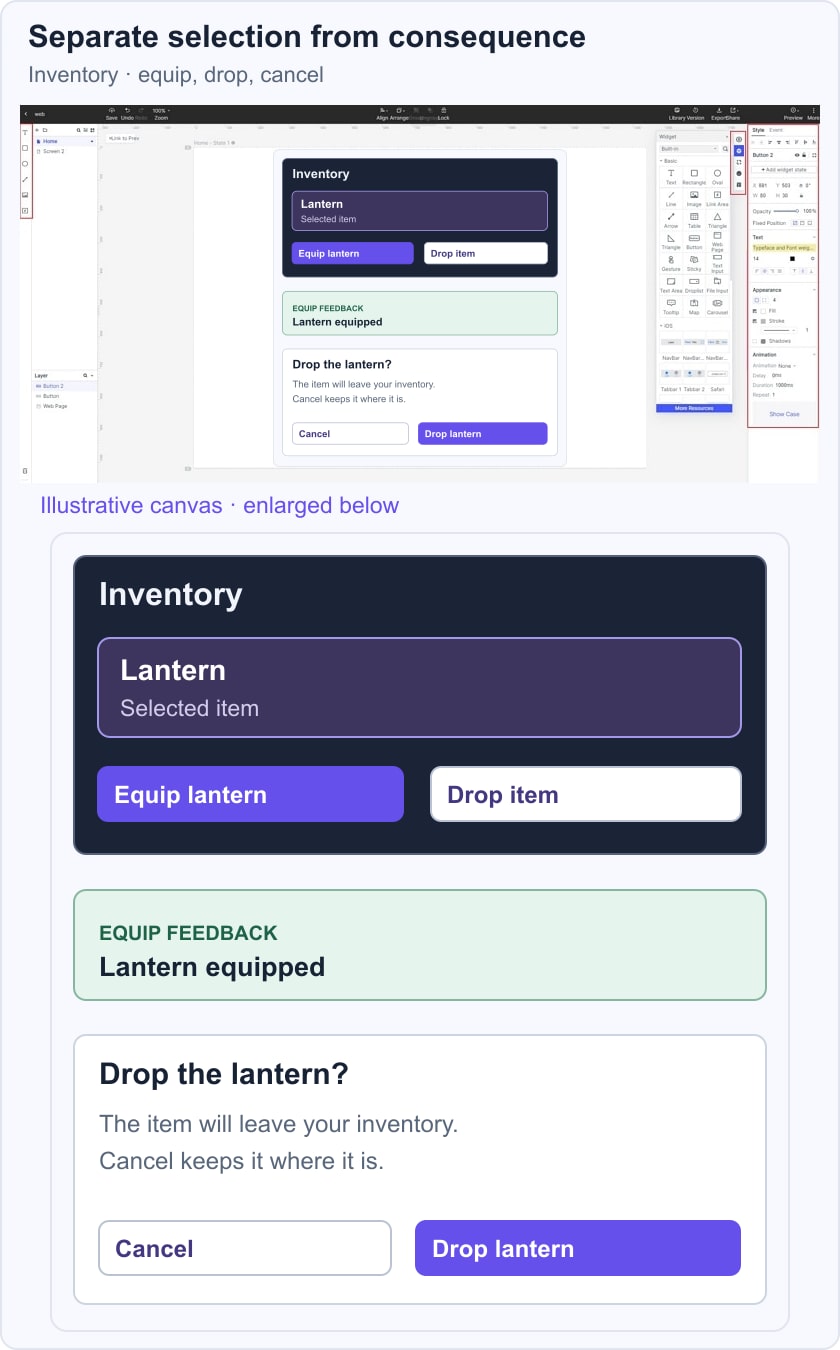
Ask a reviewer to equip the lantern, return to the inventory, and then cancel a drop attempt. Check whether they can identify the selected item and predict each action. Record the intended focus return after the dialog closes. The prototype illustrates the sequence; controller navigation, saved inventory state, and actual game behaviour need testing in the implemented build.
Step 4: Add links between screens.
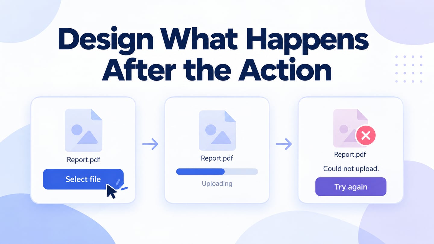
Connect the relevant screens or states in an interactive prototype of the menu flow. Link the item selection to its actions, the equip action to feedback, and the drop action to confirmation. Include a cancel route instead of showing only the successful path.
Step 5. Preview and Hand Off the Decisions
Preview in the conditions relevant to the task and communicate the limits of the simulation. Useful review contexts include:
- Desktop preview for the layout and linked states.
- A representative mobile device when the interface is intended for touch.
- An available offline demonstration when the review requires it, subject to the product’s current capabilities.
Share the prototype and its notes with the development team. The Xbox Accessibility Guidelines provide further review areas such as input, navigation, focus, and feedback. A clickable mockup is only one part of evaluating those behaviours.
Five Familiar Game References and What to Study
The original game references below are useful study prompts, not a current ranking or a claim that every release of a franchise uses the same interface. Inspect the relevant version and platform before borrowing a pattern.
#1 Skyrim and Fallout
These are separate franchises. When examining an inventory-heavy interface, study how item categories, the selected item, attributes, and available actions are organized. Ask whether a player can compare items without losing the current selection.
Pay attention to the tradeoff between detailed information and quick decisions. A dense inventory can be appropriate for one task and distracting during active play. Transfer the principle of clear hierarchy, not the game’s visual assets or an unverified claim about player retention.
#2 Firewatch
The official Firewatch description centers the experience on exploration and communication through a handheld radio. This makes it a useful reference for considering how interface prompts fit a narrative situation.
Study whether a prompt explains an available action while preserving attention to the environment. Minimal presentation still requires discoverable controls and readable dialogue; removing interface elements is not automatically easier to learn.
#3 Overwatch
For a fast-moving team game such as Overwatch, examine which information is needed during play and which belongs in menus. Review contrast against changing backgrounds, clear input prompts, and the distinction between status and action. Verify the current version before describing a particular feature or accessibility option.
#4 Tomb Raider
The Tomb Raider franchise offers a reference for studying the relationship between exploration, objectives, and interaction cues. Treat the relevant platform and release as part of the context; the franchise name alone does not establish a mobile interface pattern.
Ask whether the player can find the next action without every possible control remaining visible at once. Record when information appears, how it can be reviewed again, and whether an important instruction depends only on a brief visual effect.
#5 Destiny by Bungie
Destiny is the game franchise; Bungie is the developer. When reviewing equipment or character screens, study the hierarchy between item identity, comparison information, and actions. Distinguish those observations from a claim about every version of the live game.
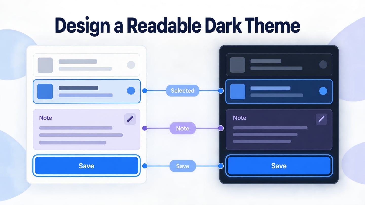
Text, iconography, and spacing should work together. Decorative typography may convey a world or character, but important instructions still need a readable treatment. Verify changes with realistic item names and the display conditions of the target platform.
Quick Recap
A useful game interface makes information, input, and feedback understandable in the player’s context. Prototype a specific decision, include mistakes and recovery, and review it before expanding the visual system.
Use the design prototype to agree on the intended behaviour, then test it in the game build with its actual input, rendering, and state management. That division keeps the design review useful without confusing a linked mockup with a finished game.