A user interface helps people understand a product and act within it, whether on a phone, website, television or watch. Dribbble offers many visual ideas for that work. Use those references to explore a direction in Mockitt’s UI design workspace, then review the task and states your own interface needs.
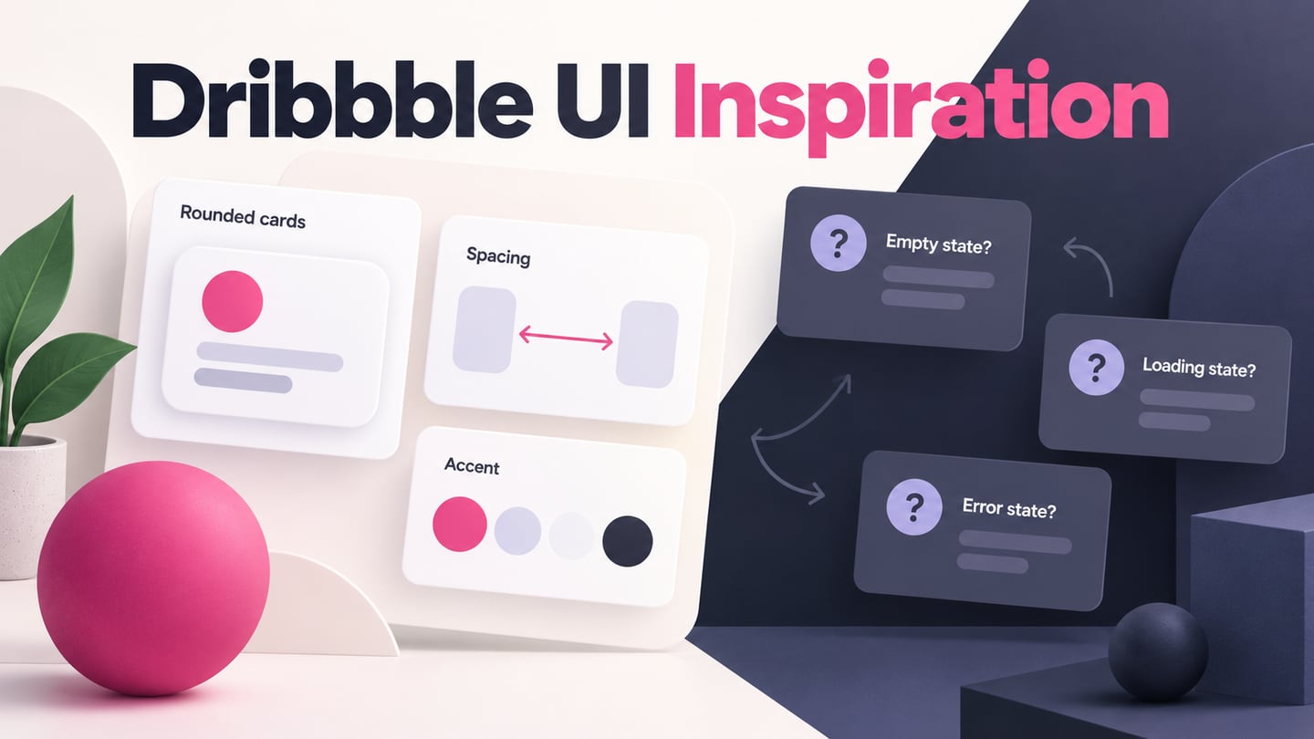
When browsing Dribbble, you may notice recurring colors, card shapes, shadows and presentation styles. Similarities can prompt a useful question: which choices support a shared task, and which simply reflect a visual trend? A small selection cannot tell us how common a style is across the whole platform.
Being observant is useful, but similarity alone does not explain a designer’s intentions or demonstrate that an interface works. Record what you can see before making a judgment about the experience.
Start with the four historical concepts below. Their original images retain the creator labels, and they illustrate visual choices rather than verified current product behavior.
Reading UI Styles on Dribbble
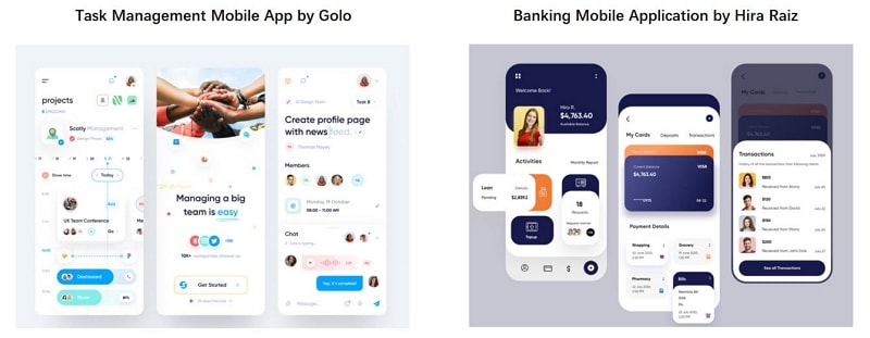
Compare the task-management concept labeled “by Golo” with the banking concept labeled “by Hira Raiz.” Both group content into rounded panels, but the information and actions serve different purposes.
Look at the visible choices in the two mobile concepts:
- The task-management screens group projects, people and activities. The banking screens group cards, contacts and payment-related information. Grouping can help scanning, but these selected screens do not show the whole task flow.
- Buttons and accent colors draw attention to selected actions. Check reach and target size on the intended device; the presentation alone does not establish comfortable thumb operation.
- Color and icons organize the layouts, but unfamiliar symbols may still need labels. Animation, transitions and scrolling cannot be evaluated from these still images.
The next pair shows a sushi landing concept and the RoboX illustration-led landing page.
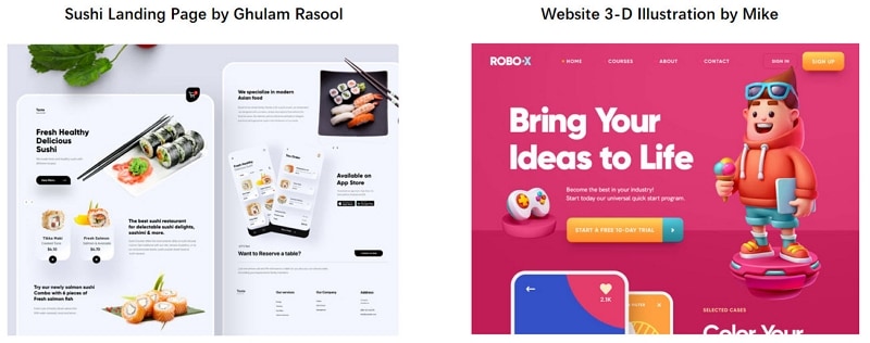
The original image labels the sushi design “by Ghulam Rasool” and the website illustration “by Mike.” Compare how each uses imagery and a prominent action:
- The sushi imagery and RoboX character create different kinds of depth. Their composition is visible; their effect on comprehension or purchase decisions is not.
- The captured upper sections pair short introductory text with large images, leaving supporting content farther down the page.
- The displayed “View Menu” and trial actions are prominent within the captured layouts. Their placement tells a visitor what the designer wants to emphasize.
A prominent first action does not mean people should never scroll. Some visitors need details before acting. Decide what must be visible immediately and what can follow, then check the actual path with representative users.
These four examples share some presentation conventions while serving different content. The useful lesson is to distinguish a transferable visual choice from an untested assumption about people’s behavior.
NN/g’s aesthetic-usability research explains why an attractive interface can receive positive comments even when people struggle with a task. Treat visual appeal and task performance as related but separate questions.
Why UI Styles Can Look Similar
The following five influences can help explain recurring styles. They are possibilities to examine, not measured explanations for every Dribbble project.
1. Designs Follow the Trends
A distinctive idea can spread as designers encounter it in products, portfolios and other media. Familiar visual choices then become part of the references a team brings to a project.
As with fashion or illustration, a popular look can attract attention. That attention does not establish that the same treatment will fit another audience, content set or use context.
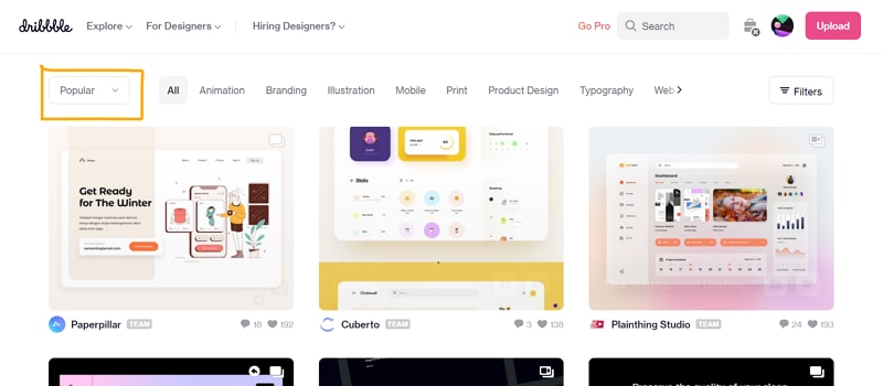
Rounded corners, restrained palettes and soft shadows appear in these examples. Such choices can support a clear hierarchy when used deliberately, but they do not make a design functional by themselves.
Before adopting a trend, check the interface principles underneath it: readable information, understandable actions, visible feedback and appropriate recovery.
2. Client References
Clients may bring a competitor’s screen or a favorite portfolio shot to a discussion. Ask which quality they value: tone, information density, navigation or something else. A reference can start a conversation without becoming a specification to copy.
3. Template-Driven UI Styles
Templates and UI kits allow designers to reuse a starting structure. When many projects start with similar components, their spacing, card shapes and typography can resemble one another.
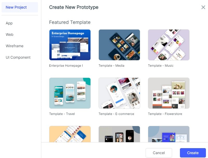
That resemblance can be useful for consistency, but the template still needs realistic content and task states. A tidy example with short labels may conceal problems with longer names, empty results or unavailable actions.
Keep the reusable structure where it fits and change it where the task demands something else. The historical template-picker image shows one way to begin; it is not a current inventory of available templates.
4. Shared Interface Problems
Different products can share interaction problems, such as helping someone compare items, find a primary action or navigate a list. Similar solutions may therefore be reasonable even when the products look different.
A concept project can explore a real problem without being a launched product. Look for the creator’s stated brief, constraints and evidence before deciding whether the work is a concept, client deliverable or implemented interface.
5. Familiarity Alongside Originality
An interface can have an original visual identity while using familiar interaction conventions. Users should not have to relearn a basic action simply because a team wants every control to look unique.
Novelty and familiarity involve tradeoffs; neither has a universal return on investment. Evaluate a choice against the task instead of assuming that imitation is faster or creates the same result.
Dribbble’s community guidelines distinguish inspiration from taking credit for another designer’s work. Use material you have permission to use, preserve attribution and develop your own design rather than copying a shot into a product.
Develop Your Own UI Concept
Visual references become more useful when you turn them into a question about your own interface. Identify the task, choose the relevant visual idea and list what the reference does not show.
For example, an appealing cinema card might show a title and an action but omit what happens when tickets are unavailable. That missing state matters more to a visitor than matching the reference’s shadow exactly.
Use a Mockitt prototype to compare the proposed screens and discuss the next action. Keep the editor’s role clear: it represents the interface for review; it does not run a cinema’s booking system.
For an original Elm Cinema example, show “Night Garden” under “Tonight.” Compare the initial listing with a “Sold out” state that offers “Choose another showing.” Keep the title visible so the visitor knows which film is unavailable. The example explores a design decision; it is not a live ticket result.
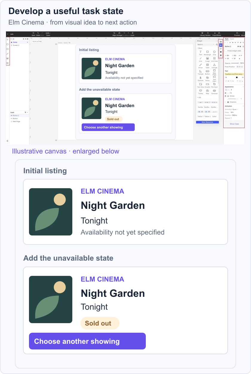
Ask a reviewer what they would do next. If you need evidence about whether people can complete the booking task, plan appropriate usability testing rather than judging the card by its appearance alone.

Useful prototype work includes:
- Use editable widgets and reusable resources for equivalent controls, then adapt the content to your task.
- Use transitions or gestures when they explain a relationship or action; avoid adding motion solely to decorate the presentation.
- Connect the relevant screens so a reviewer can follow the intended path, including an unavailable or empty state.
- Collect feedback on the specific decision and record what remains unresolved. A shared screen is not itself research evidence.
- Share the prototype with collaborators using the access options appropriate to the project and review the same version together.
- Carry the agreed layout, content and behavior into handoff. Implementation and its accessibility checks remain separate work; do not assume a prototype is production-ready code.
- Use a template as a starting point when it fits. Replace stock content and inspect the states your actual scenario requires.