
Original technology illustration source: Lifars (archived).
UI controls let people enter information, choose options, and perform actions. Their appearance should help explain their behaviour: a checkbox, a switch, and a button are not interchangeable decorations. In a UI design workspace with reusable components, define each control’s purpose and states before repeating it across a product.
Input and selection controls communicate what the person can provide and how many choices are allowed. Action controls communicate what will happen next. The label, current state, and feedback are part of the control’s design, not text added after the visual treatment is complete.
Navigation is another interaction type: a link takes someone to a destination, while a button usually performs an action. Choose the pattern that matches the behaviour and keep it consistent. A clearer control can support the task, but it does not automatically produce more visits or clicks.
What Is a UI Control?
A UI control is an interactive element through which a person supplies input, makes a selection, or triggers an action. User control as a UX principle is broader: it includes understanding consequences, reversing actions when appropriate, and leaving an unwanted path. A screen can contain many controls while still offering little meaningful choice.
A reusable control library can help teams keep visual and behavioural patterns consistent. Its value depends on the quality of the components and their implementation. Useful library responsibilities include:
- Providing reusable controls with a defined purpose.
- Documenting normal, selected, disabled, loading, and error states where relevant.
- Giving developers and designers a shared interaction specification.
- Keeping recurring labels and state treatments consistent.
- Supporting common input and action patterns.
- Recording accessibility requirements rather than relying on appearance alone.
- Reducing unnecessary reinvention of the same pattern.
- Allowing meaningful variants without changing the basic behaviour.
- Helping reviewers compare the same control across different screens.
- Identifying changes that need to be checked in all affected instances.
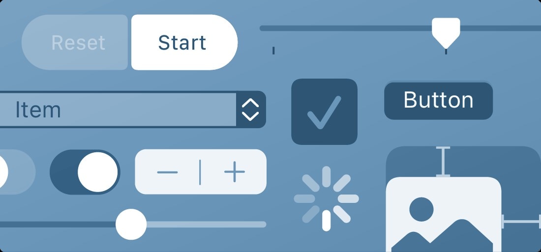
Common UI patterns include the following. Some are controls, while progress indicators provide feedback and dialogs contain controls. Distinguishing those roles makes it easier to choose the right pattern.
- Checkboxes
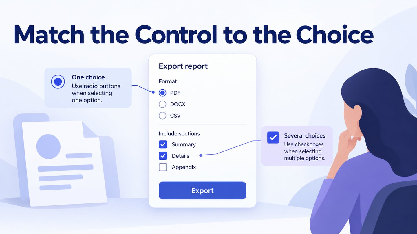
Use checkboxes for independent selections that can be combined. A group can allow several options, and one checkbox can represent a yes/no choice within a form. Make it clear whether the choice is applied immediately or submitted with the rest of the form; do not assume every checkbox behaves like an immediate switch.
- Toggle Switches
Use a switch for a binary setting when the on/off state is meaningful, typically with an immediate effect. Label the setting itself and show its current state. For example, “Show unavailable items” is clearer than a bare On/Off control with no explanation of what changes.
- Radio Buttons
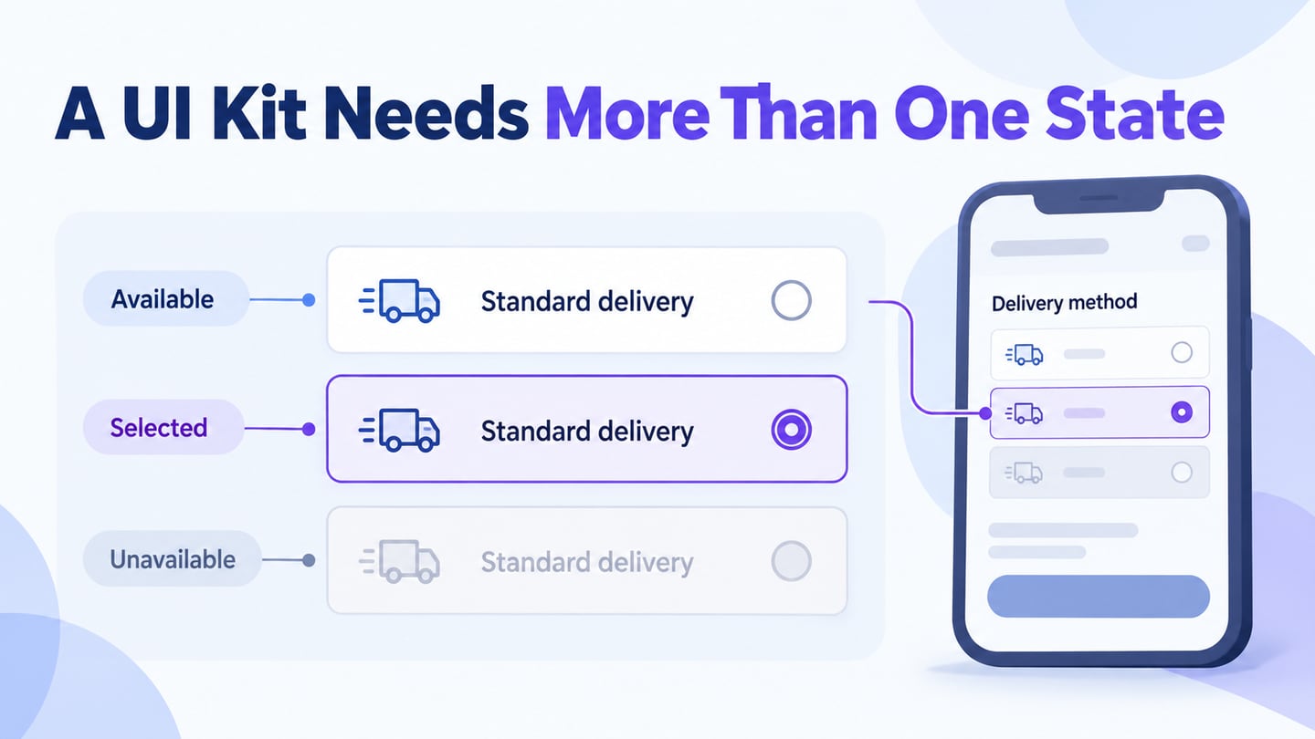
Use radio buttons for one choice from a mutually exclusive group. Selecting one option clears the previous choice in that group. Give the group a meaningful question and each option a distinct label. Do not use several independent checkboxes when the person is only allowed to choose one.
- Dropdown lists
A select list offers one option from a list in a compact space; a multi-select pattern needs its own clear behaviour. A navigation menu is a different pattern and should not be confused with a form selection merely because both open a list. Choose according to the task and review keyboard and mobile operation.
- Activity Indicators
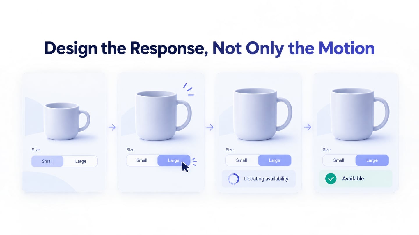
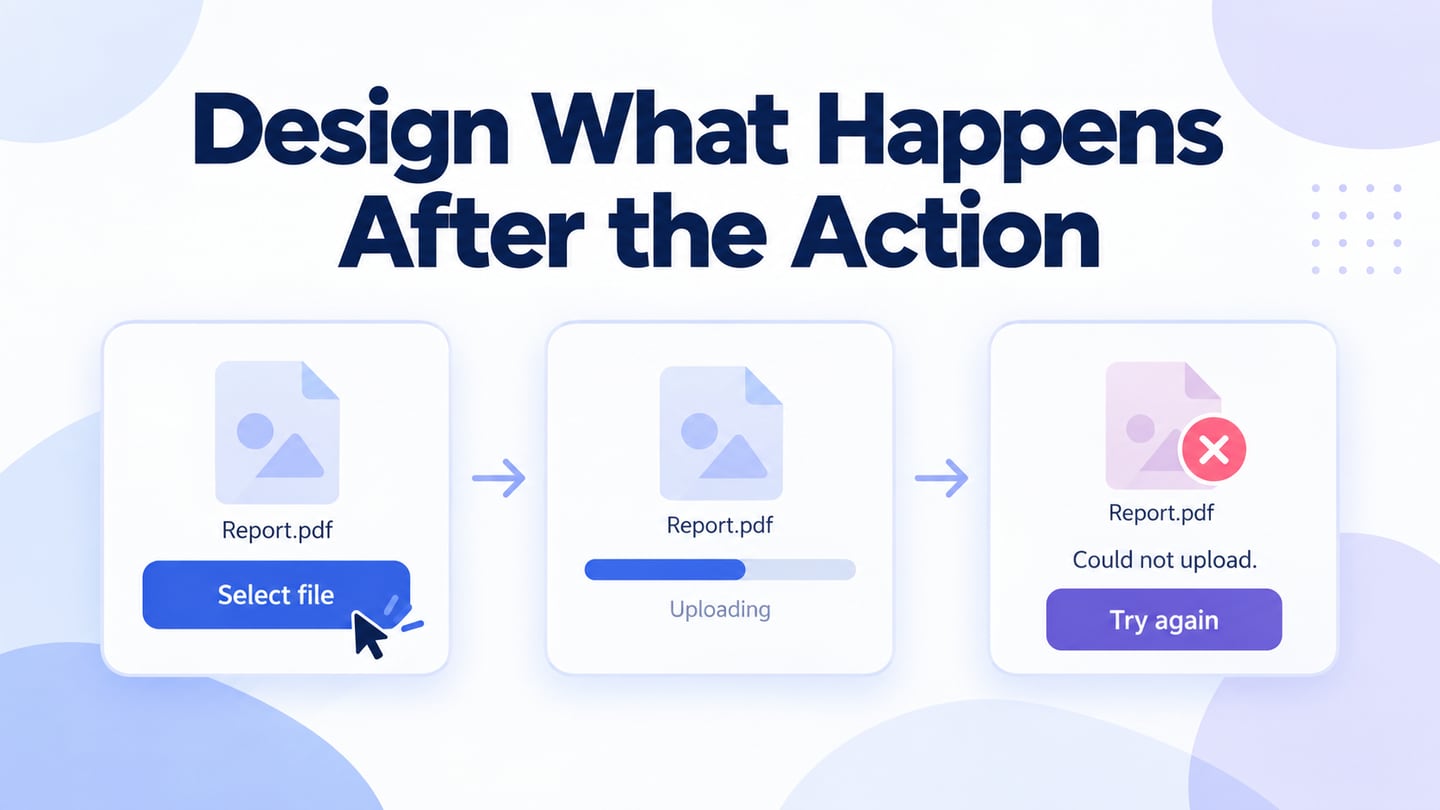
An activity indicator shows that work is in progress. An indeterminate spinner does not tell the person how long the operation will take. Show measured progress only when the system can support it, and provide an understandable result or recovery path if the operation fails.
- Buttons
A button triggers an action. Use a label that explains that action, such as “Export report” or “Save address.” Icon-only buttons still need an understandable accessible name and an appropriate visible cue. Visual styles can distinguish primary and secondary actions, but color alone should not carry the meaning.
- Dialogs
A dialog presents a focused task or decision in front of the current context. It may request confirmation, collect a small amount of information, or explain a condition. Define its title, actions, dismissal behaviour, and focus handling; it is not simply a generic box for every question or complaint.
Everyday Examples of Choosing Controls
Forms, shopping filters, settings, and document tools all combine controls. Start with the choice the person needs to make rather than copying the appearance of another screen.
A shopping filter may allow several sizes, while a delivery form may require one delivery method. A survey can use radio buttons for one answer and checkboxes for several independent answers. The number of selectable options and the moment when the choice takes effect should be clear.
A game, an account setting, and a business form may look different, but each needs a clear relationship between the label, the selected state, and the outcome of the action.
One form, three different control decisions
For an illustrative report-export form, let the person choose one format, PDF or CSV, using a radio group. Use checkboxes for optional sections such as Summary and Detailed rows. Finish with “Export report” so changing a choice does not unexpectedly download a file.
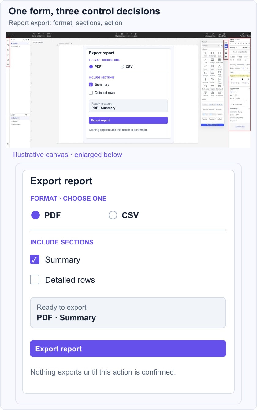
Show the selected format and sections before the action. If a section is not supported by the chosen format, explain that constraint next to the affected option instead of silently ignoring it. In the prototype, check whether someone can describe what will export before pressing the button. In implementation, verify the resulting file, keyboard operation, labels, and state changes separately.
Common Uses for Controls
Before selecting a control, establish what a person needs to do:
- Enter information with a clear label and expected format.
- Choose one option or several independent options.
- Change an immediate setting or prepare a choice for later submission.
- Perform an action with understandable consequences.
- See the current state and feedback from the previous action.
- Correct a mistake, cancel, or leave the task when appropriate.
These decisions appear in many contexts:
- Web forms collect information and submit it through clearly labeled actions.
- Games use controls for supported actions and provide feedback about their result.
- Onboarding forms request only the information needed for the step and explain validation errors.
- Surveys group related questions and make single-choice versus multiple-choice answers explicit.
- Appointment services use fields and selection controls to choose a time and provide relevant details; a dialog should not be mistaken for a medical consultation.
- Document and spreadsheet applications use menus, fields, and action buttons for editing and exporting, with labels that distinguish a setting from a command.
The common principle is predictability: the control should make the permitted choice and its effect understandable in that context.
The relationships between Controls and UX.
Controls contribute to UX through understandable behaviour and usable implementation. W3C’s control-label guidance explains the importance of meaningful labels associated with inputs. Related controls also need an understandable group structure. A visually clear mockup should carry these requirements into development.
- Keep the purpose and number of allowed choices clear.
- Make controls discoverable and their state distinguishable.
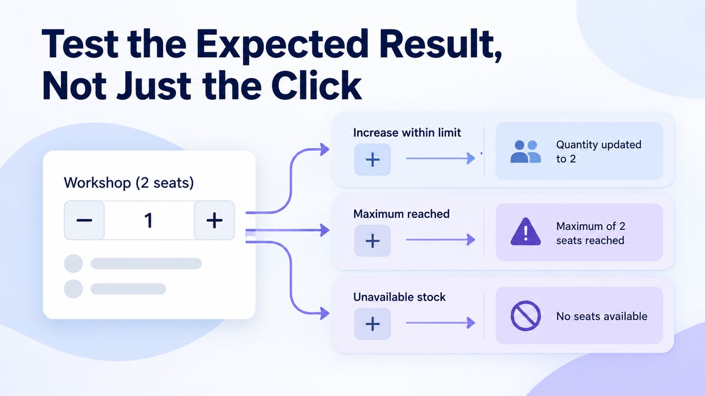
- Provide feedback about the result of an action, rather than merely collecting feedback from users.
- Offer appropriate ways to revise a selection, cancel a pending action, or change a setting.
Conclusion
Before choosing a control, ask how many options can be selected, whether the choices are independent, when the change takes effect, and how someone can recover from a mistake. Then inspect the default, selected, error, and completion states with realistic content.
Consistent controls support understanding when the interaction and implementation match. Review the design in context, then verify labels, focus, keyboard operation, and resulting behaviour in the working product. A familiar shape is a useful start; it is not a substitute for those checks.