Have you ever searched a support forum because an app left you unsure what to do next? That uncertainty can reveal a UX problem, but one frustrating moment is not enough to judge an entire product. Useful UX design principles help turn the complaint into a specific question about expectations, control, feedback, or recovery.
Use these ten usability patterns to review the decisions in your own interface. Interfaces change, and a feature can involve competing user needs. For each pattern, identify the task, what the person expects, what happens instead, and a change that can be reviewed. Do not treat an old screenshot or anecdote as proof of a current product defect.
1. Message Deletion That Does Not Match Expectations
The original example criticized WhatsApp’s deletion notice. Its current message-deletion guidance confirms that messages deleted for everyone leave a notice and that recipients may already have seen the content. Deletion therefore should not be presented as a guarantee that nobody saw a message.
What should the design make clear?
The sender may want to correct a mistake, while the recipient may need to understand why part of the conversation changed. A visible notice is not automatically bad UX. The useful improvement is clear wording about what will be removed, for whom, and what cannot be undone. Review whether people distinguish deleting their own copy from requesting deletion for everyone.
2. Autoplay That Interrupts Browsing
A preview that starts while someone is reading a title can interrupt the task, especially if sound is unexpected. Netflix was the original example, but it is inaccurate to say there is no choice: its preview-autoplay settings allow the feature to be turned on or off. Availability and behaviour can differ by device.
What should the design make clear?
Give people control over motion and sound, make the control discoverable, and preserve access to the information they came to read. Test whether browsing requires avoiding large hover regions or repeatedly stopping media. The question is how autoplay affects the task, not whether every automatic action is inherently wrong.
3. Optional Charges Hidden in a Booking Flow
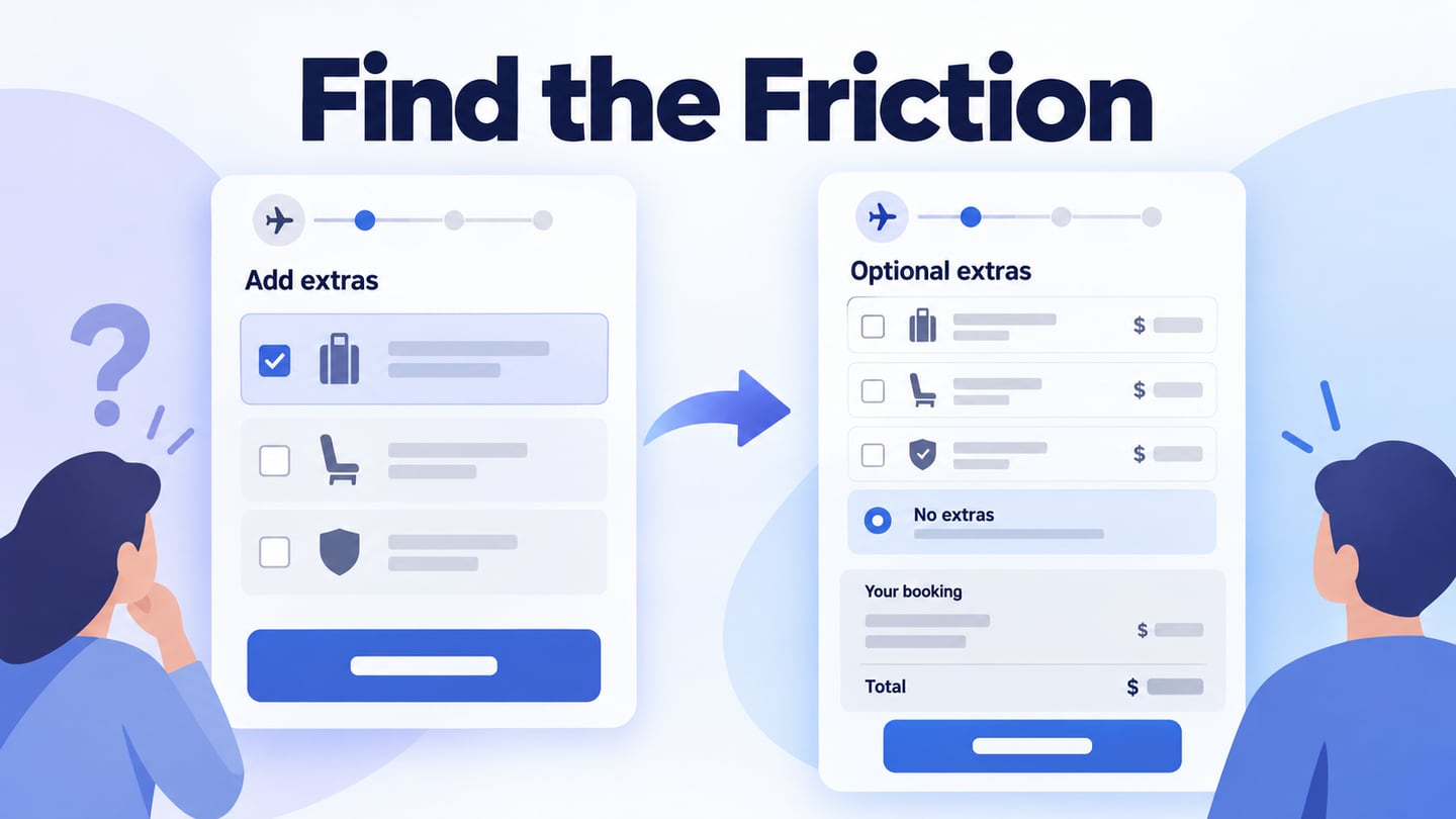
The older article associated this pattern with Ryanair. Without a current booking test, it should not be treated as a claim about that airline’s present interface. The general problem is an optional extra whose price, selection state, or decline option is hard to find. A person may continue without understanding what they have chosen.
What should the design make clear?
Place the optional item, its cost, and the choice to decline together. Show the resulting selection in the booking summary before commitment. Inspect whether the person can explain the total and distinguish the required purchase from an extra; do not infer the designer’s intent from a confusing screen.
Turn a complaint into a reviewable alternative
For an illustrative booking flow, put the optional extra and its price together: “Add flexible cancellation — 20.00 extra.” Offer a visible “Continue without extra” choice and show “Selected: no extra” on the review screen when it is declined. Use fictional values and avoid implying that this is any named company’s current interface.
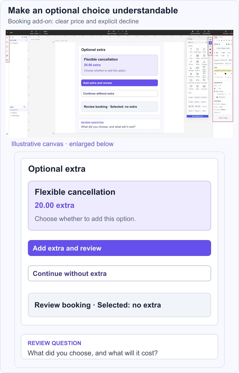
Build the two choices and summary in a connected booking prototype. Ask a reviewer to book without the extra, then explain the selected options before confirming. Record hesitation, misinterpretation, and the actual route taken. This gives a concrete design question to resolve; it does not establish a conversion improvement or a finding about a live booking service.
4. A Storage Error Without a Useful Recovery Route
Running out of storage while trying to capture a photo can interrupt an important task. Current Apple storage guidance provides ways to inspect usage and manage content. Design feedback that explains the problem and helps the person find an available recovery option.
What should the design make clear?
An error at the point of action should explain what happened and offer an appropriate next step. A storage-management route is more useful than a bare “failed” message, but it should not promise an exact number of photos to delete when file sizes vary. Preserve the person’s current task where possible and make any destructive action explicit.
5. Super long dropdowns
A long country or region selector can be difficult to scan, especially when a person is unsure which name the list uses. The issue is not simply the number of options: the device, available space, naming, keyboard support, and frequency of use affect whether the control works.
What should the design make clear?
Use recognizable names and an appropriate way to locate an option. A searchable selector may help with a long list, but it also needs an understandable label, keyboard operation, and useful no-result behaviour. Do not replace a native control with a custom one solely because the list has more than ten items. Test finding an uncommon value and correcting an accidental selection.
6. Password Rules That Add Friction Without Clear Benefit
Hidden password requirements, blocked pasting, and unclear errors can make account creation unnecessarily difficult. That does not mean that weak personal passwords are a better design. Security and usability need to be addressed together.
What should the design make clear?
Explain the applicable requirements before submission and provide a useful correction message. NIST’s password guidance supports password-manager and autofill use and rejects arbitrary mixtures-of-character-type requirements in its scope. Let the security team define an appropriate policy, then design a form that supports it. Avoid blocking paste or encouraging memorable but predictable secrets as a supposed UX shortcut.
7. Live Support That Promises an Immediate Reply
The earlier example named O2, but no current support queue is being evaluated here. The transferable problem is a “Chat now” promise that creates an expectation of immediate help when a person will actually wait. A queue itself is not necessarily a defect; an unexplained or misleading queue can be.
What should the design make clear?
Show the available support channel, its current availability, and what happens after a request is sent. Give an honest estimate only when the service can support it, and explain whether the person can leave and return. A bot, agent queue, or email route can each be appropriate; label which one the person is entering rather than promising an instant human reply.
8. An Account Tab That Hides the Next Step
Some apps direct people to a website to manage a subscription or account. An external route can reflect platform or account constraints. The UX question is whether the tab explains the destination and provides a clear, usable next action.
What should the design make clear?
Use a descriptive action such as “Manage subscription on the website” when that is the actual route. Explain any sign-in requirement and avoid implying that a settings screen is editable when it only contains instructions. Removing the tab is not automatically an improvement if it makes the account task harder to discover.
9. A Rating Display Without Enough Context
A single star beside a number can represent an average rating rather than a count of stars. The older Fiverr example treated that notation as inherently wrong, but interpretation depends on the label, scale, review count, and surrounding context.
What should the design make clear?
For a rating summary, make the scale and sample visible when they matter, such as an average out of five with a review count. Do not rely on the star shape alone to explain the number. Ask a reviewer what the value means and where they would read the underlying feedback. A compact display can work if it communicates those facts clearly.
10. Connected Features That Obstruct the Basic Task
The discontinued Juicero product illustrates a broader question about dependencies: requiring an account, connection, or companion app for an otherwise simple task can create failure points. Decide which dependency is necessary and which is merely part of the product’s surrounding service.
What should the design make clear?
Map the basic task separately from optional connected features. Explain what remains available if the network, account, or companion device is unavailable, and what cannot proceed safely. Do not add a dependency merely because a connected feature looks sophisticated. For hardware, usability review must also include the physical task rather than judging only the app screen.
Conclusion
A useful UX critique explains the task, the expectation, the mismatch, and a practical alternative. It avoids assuming that every inconvenience is intentional or that a familiar brand still uses an old design. Review the proposed change with people attempting the task, keep observations separate from opinion, and carry unresolved behaviour into implementation testing. Clear recovery and honest expectations are stronger goals than a promise that a prettier screen will increase conversions.