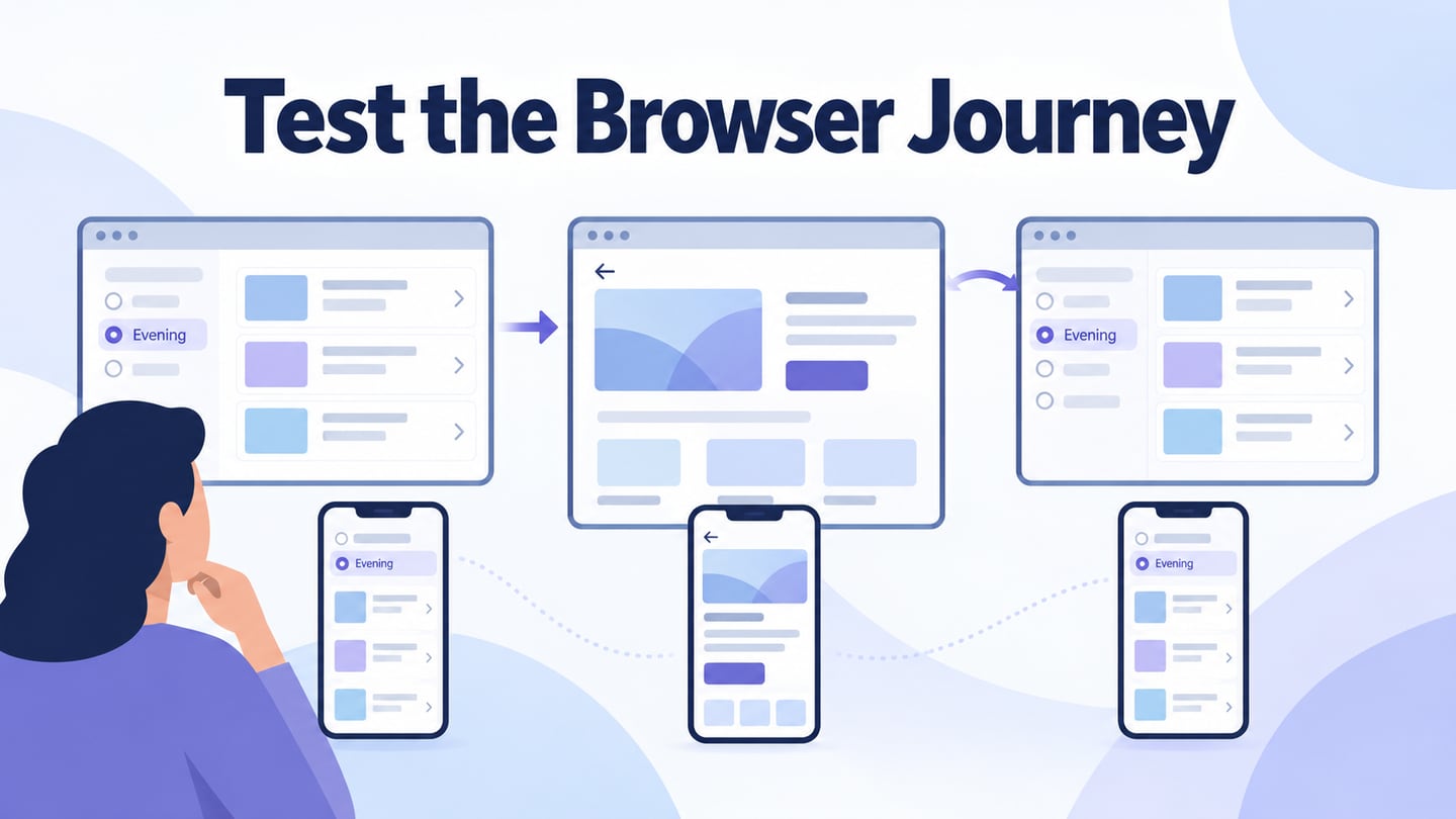
Android UI testing checks whether the interface presents the right information and responds correctly to interaction on an Android device. It includes more than visual polish: navigation, text entry, loading, errors, accessibility, and different device conditions can change the experience. Start with the broader UI testing process, then distinguish two kinds of evidence: a prototype can reveal unclear design decisions; a working app is needed to verify actual Android behaviour.
Use a Prototype to Review the Intended Android UI
Mockitt is a prototyping and review tool, not an Android test runner. Use Mockitt’s mobile prototype workflow to make screen states and interactions inspectable before or during implementation. For automated tests of an implemented app, Android’s behaviour-testing guidance distinguishes Espresso for View-based app interactions, Compose testing APIs for Compose interfaces, and UI Automator for interactions across apps and system UI. Choose according to the implemented interface and the behaviour being tested.

1. Components and UI resources
Use available components and templates to model the task, then replace sample labels and data with meaningful fictional content. Reuse the same field and status styles across the test screens. A template is a starting point for the design, not evidence that the resulting Android interface is accessible or correctly implemented.
2. Screen and interaction design
Connect the screens and component states needed for the test scenario. Include the result of a successful action and at least the important error or interruption states. A connected prototype demonstrates the intended flow without running the application’s real data or permission logic.
3. Presentation and review
Preview the flow at the intended device size and share it with reviewers. State the task without explaining which control to choose. Use access settings appropriate to the review audience and check the shared view before the session.
Collect comments about specific labels, transitions, and missing states. If an offline prototype package is needed, verify that copy separately. Neither a shared browser preview nor an offline demonstration replaces tests of the installed Android app.
4. Shared browser editing
Keep the design and its review version in the shared workspace. Give the scenario a clear name so comments refer to the intended draft. After a change, check that all affected screens and states remain consistent.
A shared link can reduce confusion over file copies, but reviewers still need to know which version is under review and what question they are answering.
5. Handoff evidence
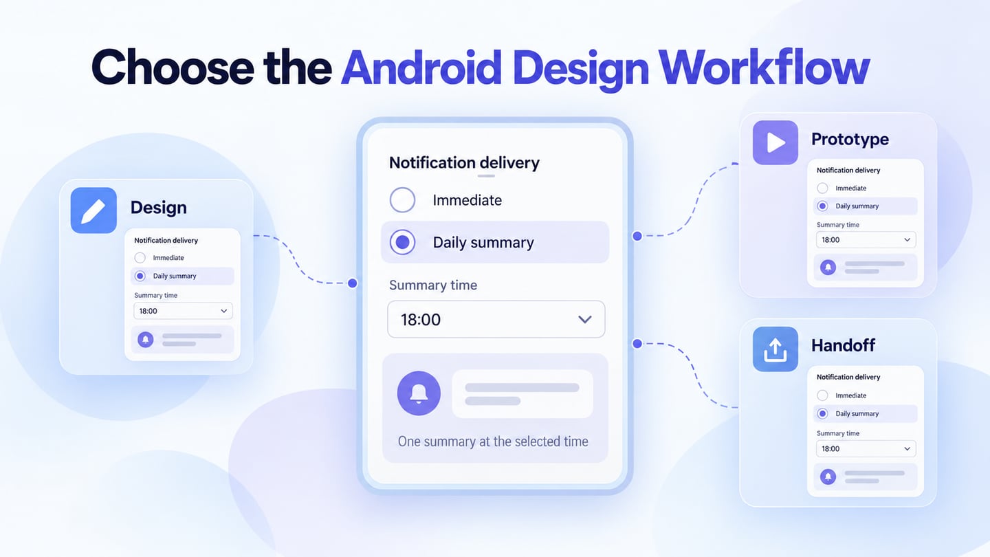
Share the expected states, component properties, interaction notes, and unresolved questions with developers and testers. Inspectable design information supports implementation; exported code drafts are not proof that Android behaviour, accessibility, or data handling has passed testing.
6. Team decisions
Use the review to agree on the expected result and the checks that remain for implementation. Assign ownership for each issue instead of treating a comment thread as a completed test report. Account permissions and security require their own current evidence; a design review cannot establish them.
Prepare and Review an Android UI Scenario
Step 1: Create the Android task screens
Choose a mobile screen size appropriate to the target Android devices. A fixed-size prototype can reveal layout questions, but it does not reproduce every device configuration or Android lifecycle event.
Create a prototype project and name it for the scenario, such as “Delivery address: validation and save.” The retained guide images show earlier Mockitt interfaces; use equivalent controls in the current workspace.
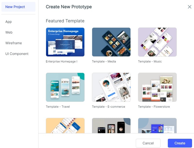
Start with a blank project or a relevant template. Create the input, error, and saved states before adding decorative detail, so the intended behaviour is visible throughout the review.
Review the layout at more than one relevant screen size. If you change the prototype’s dimensions, inspect labels, controls, and scrolling rather than assuming they adapt correctly.
Use an address form as a focused test case
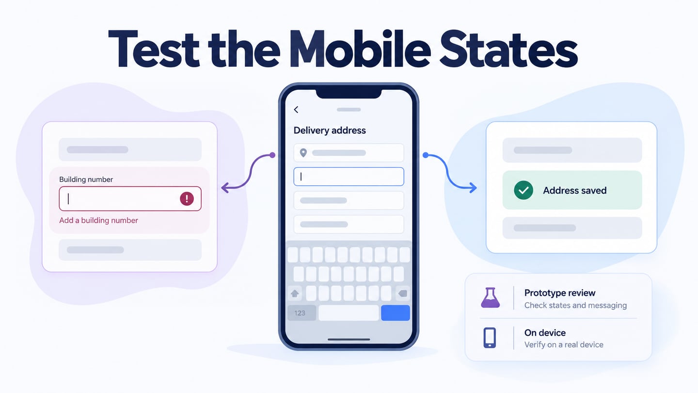
For an illustrative delivery-address form, start with Cedar Street entered and the building-number field empty. The attempted save should reveal “Enter a building number” near the field while preserving the street. After a valid number is entered, the saved state should show the complete address. These are expected design states, not observed test results.
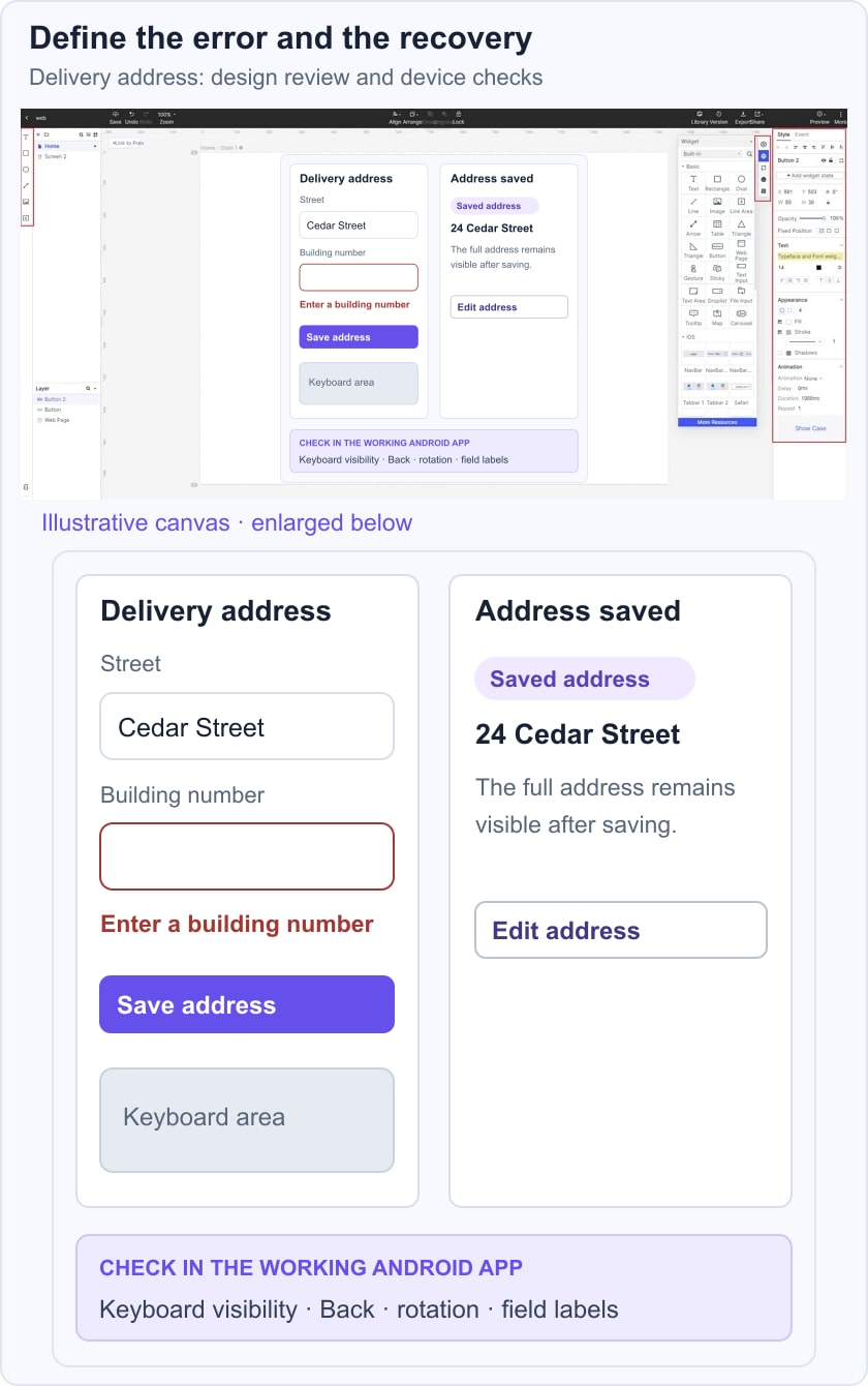
In a prototype session, ask a reviewer to save the address and recover from the missing value. Record whether they identify the field and understand the saved confirmation. In the working Android app, separately verify that the keyboard does not hide the action, Back behaves as intended, rotation or recreation preserves appropriate input, and assistive technology can identify the label and error. Keep the build, device, steps, expected result, and observed result with each defect.
Step 2: Build the UI and its states
- Add Widgets and Icons
Add text fields, labels, status messages, and buttons from the available component library. Use only the controls needed for the scenario so an unrelated component does not distract from the review.
Place the components on the canvas and align related labels and fields. Keep enough space for a useful error message instead of designing only the empty default state.
Select a component and adjust its properties. Check long content, enlarged text, and the label’s relationship to the input when planning the implemented layout.
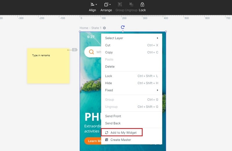
Reuse the field and button patterns where appropriate. The retained guide capture shows an earlier saved-widget action; its purpose is consistent components, not a requirement to use that exact menu.
- Add Links between Screens
- Select the action and connect it to the relevant screen or state using the interaction controls.
- Check the action, target, and transition settings. A failed save should not lead to the same confirmation as a successful one.
For a repeated component in the earlier guide workflow:
- Create a reusable master from the selected widget.
- Place instances where the same pattern is needed.
- Review affected instances when editing the shared master.
- To record an expected behaviour:
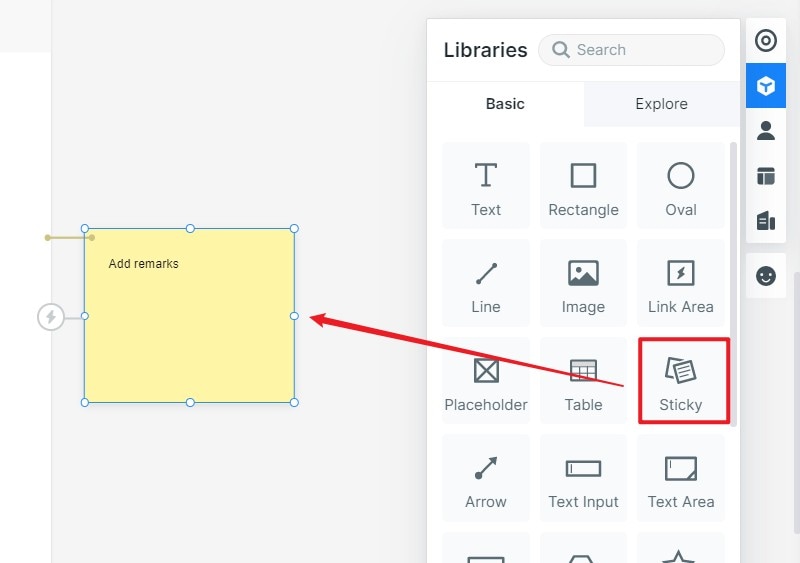
- Add an annotation or sticky note near the relevant state.
- Describe what should happen and what remains to be checked in the working app.
- Confirm whether the note belongs in the participant’s view or only in the team’s review.
- Model the important state changes
Use component or screen states to represent validation, loading, failure, and completion. Choose the smallest state change that explains the task. Do not rely on animation to make an otherwise unclear result understandable.
To connect component states:
- Create or select the component whose behaviour needs review.
- Name its states according to the task, such as missing number and saved address.
- Link the appropriate action to each state and preview the transition, including recovery from the error.
Step 3: Preview the intended flow
On a computer:
- Open Preview from the editor.
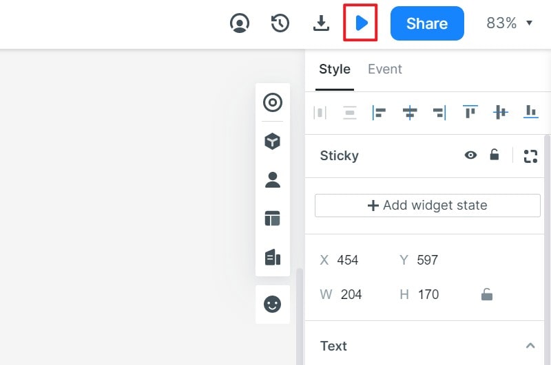
- Inspect scrolling, interaction highlights, annotations, and the device frame as appropriate.
- Return to the intended mobile size when assessing readability; a large presentation view can conceal a cramped layout.
On a phone:
- Obtain the prototype’s review link or QR code from Share.
- Open it on the phone and attempt the task without extra guidance. This checks the prototype’s presentation, not all native Android behaviour.
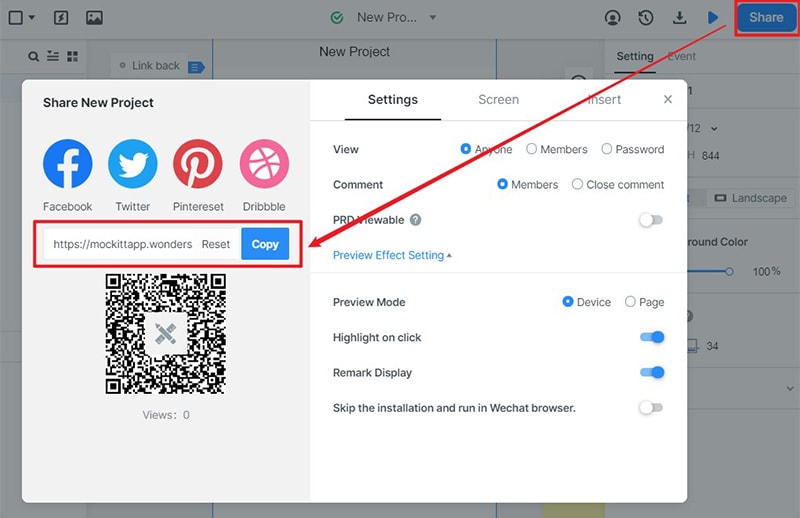
For an offline prototype demonstration:
- Use the supported HTML demo package where available, unpack it, and verify the entry file in a compatible browser before the session.
Step 4: Share the scenario and record findings
- Share the review link and identify the scenario and version.
- Give the reviewer the task and record what they do before offering help.
- Choose suitable access settings for the audience.
- Record the issue, its location, and the intended correction. Retest a corrected design and carry implementation checks into the app’s test plan.
Android UI Checks for the Working App
Check text, icons, selected states, and errors using the actual implemented interface. Review different screen sizes, text settings, and light or dark presentation where supported. Include screen-reader labels and a meaningful focus order; appearance alone does not establish accessibility.
Test loading, empty, success, and failed-network states. Verify that retries do not duplicate an operation and that a stale value is not presented as a fresh result. Check the displayed data against the intended source rather than judging only whether a spinner disappears.
Check the keyboard, orientation, window size, and system insets. Inputs and their errors should remain reachable when the keyboard appears. Android’s layout guidance explicitly calls out safe areas, different form factors, and essential interactions.
Exercise taps, scrolling, text entry, and other supported interactions on representative devices. Confirm the intended touch area and disabled behaviour. Test the relevant input methods rather than assuming every touch or gesture should trigger the same action.
Test system Back, leaving and returning to the app, permission prompts where relevant, and restoration of appropriate state. Separate reproducible functional failures from a participant’s misunderstanding: both matter, but they require different evidence and fixes.