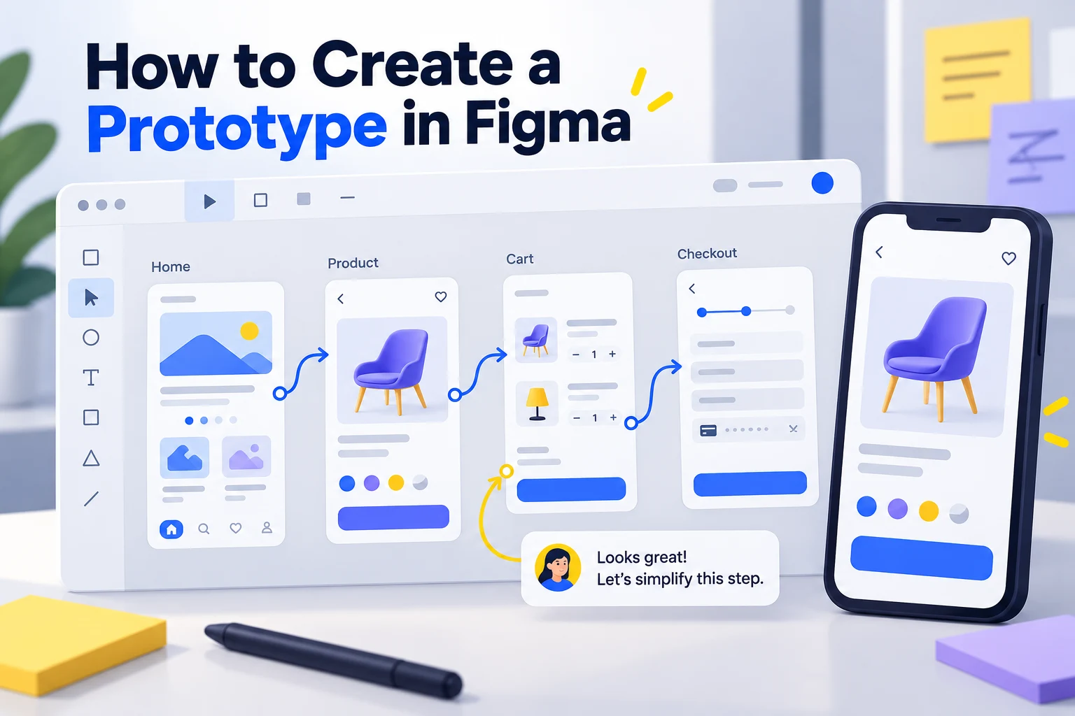
To create a clickable prototype in Figma, prepare your screens as frames, connect a button or other hotspot to its destination, set a flow starting point, and play the flow. The useful result is a path someone can follow and review, rather than a collection of finished-looking screens. This guide walks through the Figma setup and preserves the practical Mockitt alternative workflow from the original tutorial.
Choose one task before connecting anything. For a grocery checkout, use Cart, Address, Delivery and Confirmation, with a route back to change a selection. If you are comparing Figma with Mockitt's interactive prototype editor, use the same screens, content and review task in both tools.
How to create an interactive, clickable prototype in Figma
Step 1: Open the design and enter Prototype mode
Open your Figma design file with edit access. Keep each destination screen in a top-level frame and select the Prototype tab in the right sidebar. You can switch between Design and Prototype with Shift + E. Begin with the screens needed for the task; decorative detail can wait until the route works.
For the checkout example, the Cart frame needs an order summary and a Checkout button. Address needs a selected address and a Continue button. Delivery needs delivery choices. Confirmation needs an order result. These are example states to build, not a claim that the prototype processes a real order.
Step 2: Give frames and actions meaningful names
Rename the frames in the Layers panel so each name describes its state. Use “Cart,” “Address,” “Delivery” and “Confirmation” rather than “Frame 1” through “Frame 4.” Name important layers, such as “Checkout button,” so you can select the correct hotspot when several elements overlap.
Step 3: Set the flow starting point
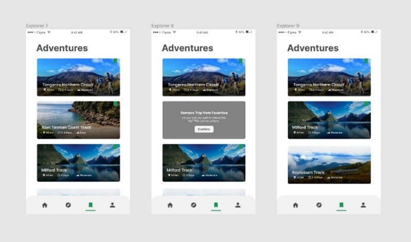
Select Cart, open the Prototype tab, and add a starting point with the + in Flow starting point. Figma can also create a starting point when you make the first connection between previously unconnected frames. Give the flow a recognizable name such as “Grocery checkout.”
To see the page's flows, click an empty area of the canvas and look in the Prototype tab. This replaces the older “Starting Frame” dropdown instructions that some tutorials still show. Figma's flow starting point documentation explains the current controls. A flow can contain several connected frames; its starting point belongs to a top-level frame.
Step 4: Connect the actions and recovery paths
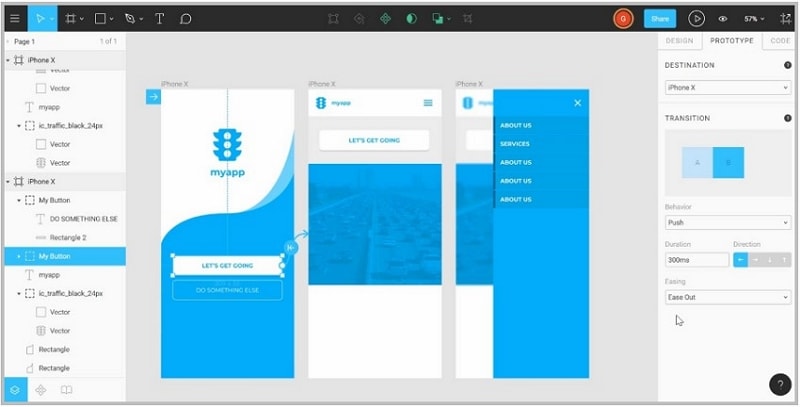
Select the Checkout button and drag its connection handle to Address. In the interaction settings, use a click or tap trigger and a navigation action to the intended frame. Repeat for Address → Delivery and Delivery → Confirmation. Follow Figma's prototype connection model: the hotspot starts the interaction, while the destination frame determines where navigation ends.
Add the routes a reviewer may actually take: return to Cart, change an address, and recover when a delivery option is unavailable. For a simple first prototype, separate frames can represent these states. Select animation because it explains the transition, rather than applying a different effect to every connection.
Step 5: Preview, present and share the task
Use Preview to play the flow beside your design or Present to open it in presentation view. Start from Cart and use the buttons you connected, rather than advancing through frames manually. Figma's playback guide distinguishes these two views and explains their scaling options.
Test the route in both directions. A missing frame may be disconnected; a button that appears inactive may have its connection on a different layer. If content extends below the screen, check the frame's overflow settings using the Figma scrolling guide. Before inviting a reviewer, open the shared prototype link with the intended access permissions and confirm it begins at the right flow.
What to review in the checkout prototype
Give a reviewer a concrete task: “Order the items in this cart using the office address and standard delivery.” Then ask them to change the address before confirming. Watch where they hesitate and which information they expect to carry forward.
| Task moment | Expected result | Problem worth recording |
|---|---|---|
| Leave Cart | The next step is clearly Address | The button label does not explain the next action |
| Change the address | The chosen address remains visible on review | The flow silently resets the selection |
| Choose delivery | Price and timing are understandable before confirmation | A change appears only after the decision |
| Recover from an unavailable option | A clear alternative leads back to delivery selection | The error state has no usable exit |
A clickable route can reveal these design problems. It does not establish payment processing, inventory accuracy or the accessibility of the eventual application; those need implementation and testing of their own.
When Mockitt is a useful Figma alternative
Mockitt is worth considering when your task centers on assembling screens from reusable components, linking actions, and sharing a browser-based prototype for team review. Its prototype product includes reusable UI components, interaction links, real-time editing and shared review. Choose it for the workflow your team needs, rather than assuming one editor is best for every organization.

Compare practical work: how easily you can change repeated elements, identify a broken link, invite a reviewer and explain the handoff. Keep your Figma file if it already supports the task well. If you try Mockitt, build the same small flow before moving a larger project.
How to create the same prototype in Mockitt
The retained images below are Mockitt guide examples of the project, component and preview workflow. Their interface reflects the original guide; use them to understand the operation rather than to infer today's exact menu placement.
Step 1: Create a project and choose the screen size
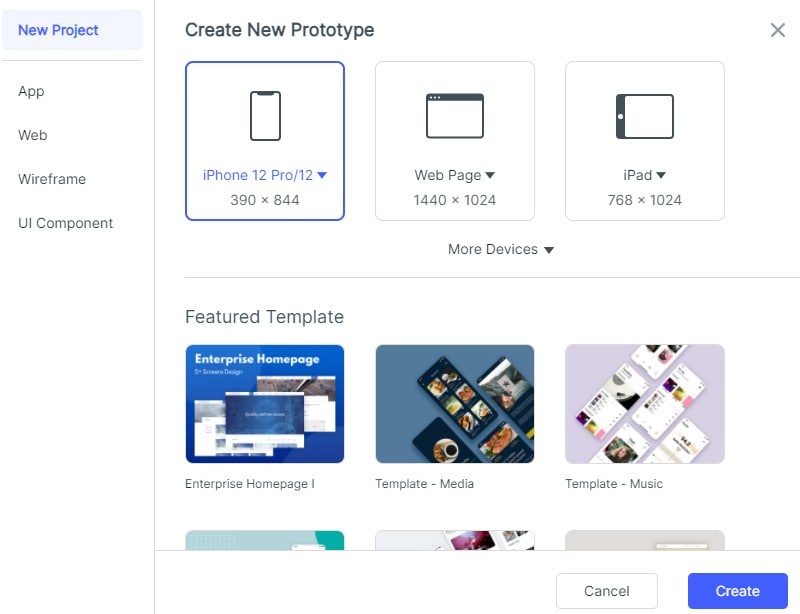
Create a prototype project, give it a recognizable name, and choose a screen size suited to the device being reviewed. For the checkout task, keep one mobile size across Cart, Address, Delivery and Confirmation so differences in the test come from the flow, not unrelated layouts.
Step 2: Add screens, components and realistic content
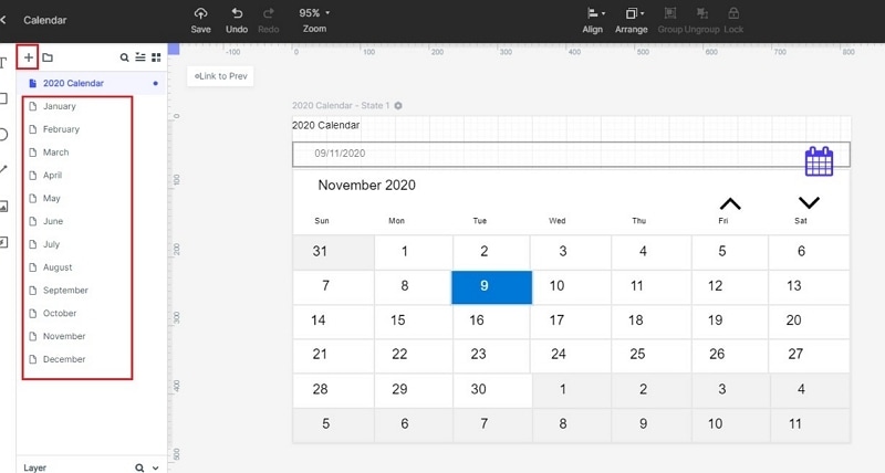
Add a screen for each state and name it before building out the layout. The original calendar example shows separate pages in the screen list. In the checkout project, use that list for the four task steps and any recovery screen.
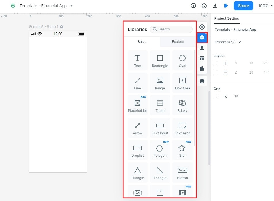
Use text, images, buttons and input components to build the screens. Reuse repeated navigation and action styles, then fill them with representative labels and values. A label such as “Continue to delivery” gives a reviewer more to respond to than a placeholder such as “Button.”
Step 3: Link the controls to their destinations
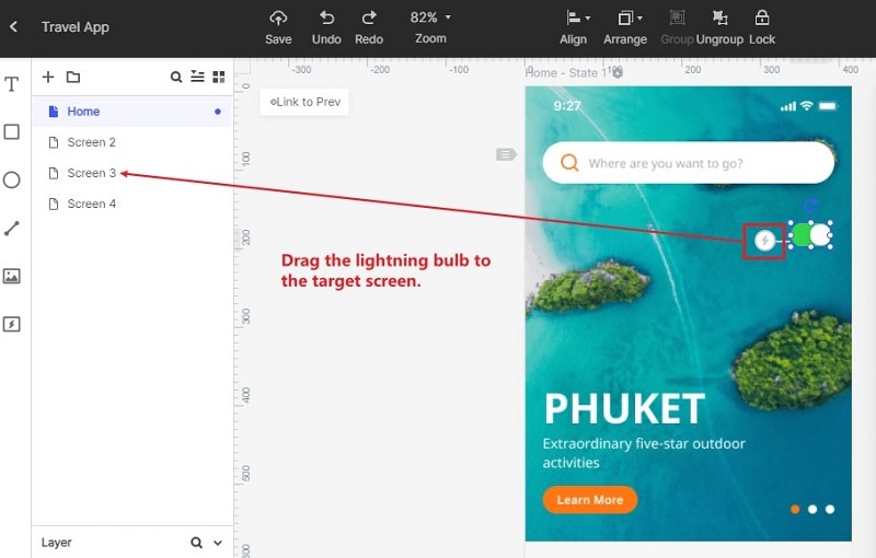
Select an actionable element and create its link to the next screen. The original guide shows dragging the lightning-shaped connection handle to a target in the screen list. Set the intended trigger, destination and transition, then repeat for the remaining actions. Add return routes deliberately; a forward-only demonstration misses the user's ability to reconsider a choice.
For the grocery example, connect Checkout to Address and continue through Delivery to Confirmation. Include a way to change the address and a delivery-unavailable state. This keeps the comparison focused on the same user task in each tool.
Step 4: Preview and share for review
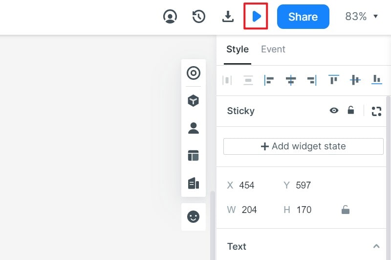
Open the prototype preview and follow the actual controls from the first screen to the result. Use the sharing option to send a review link, then confirm the recipient can open it. Try the target device size and note where labels, content or interaction targets need revision.
The finished prototype should let a reviewer complete the task, reverse a decision and understand the result. Keep the source editable, record the questions raised during review, and improve those states before spending time on more decorative detail.